InvestU Application


The Problem
I'm certain that many of you have experienced the same sense of being lost and confused about financial matters as I did in my younger years. Inadequate early education on financial literacy leaves teenagers feeling overwhelmed by the complexities of personal finance and investing. The current lack of comprehensive financial education raises the question of why we aren't equipping individuals with the necessary skills earlier in life.
Solution
An end to end engaging and interactive application that empowers teenagers to confidently learn, encourage to invest, and build strong financial foundations.
My Role
UX Researcher - UX/UI Designer
Tools
Figma, Miro, Google suite, Slack, Zoom
Project Overview

A research survey (22 responses) and 5 interviews were conducted to understand:
What do teens know about investing?
How do teens understand what investing is?
Key Insights
An overwhelming amount of information that becomes intimidating.
Young people are scared and confused when it comes to investing.
Learning investing (money in general) is a continual process.
100% of participants believe they did not learn enough about investing during school years.
Over 70% of them said they learn best through visual means.


Camilla:
“A lot of fear. I still don’t feel like I’m super knowledgeable”
Arian:
“I would still say I’m somewhat confused. I’m bamboozled between choosing where I would want to put my money”
Research
We put all the user insights into an Affinity Diagram to organize the data and here are the key insights:
Define
Who?
Teenagers and young adults
What?
The overwhelming amount of information is scary
When?
Often the problem begins during Highschool
Why?
Crucial in setting young people up for long term financial success
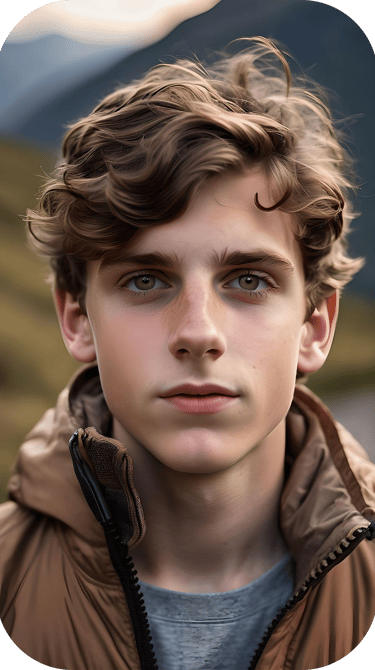

User Persona

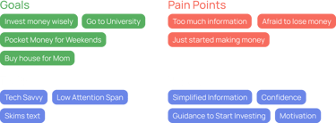
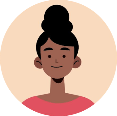
Nick Thomson
Nick is a 17 year-old high school student who just started making his own money. He is the oldest of three kids and the first who wants to go to University but is scared about how much it'll cost. He feels that he hasn't learnt much about financial matters in school and is confused about managing his expenses. He doesn't know where to start.
Competitor Analysis

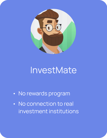
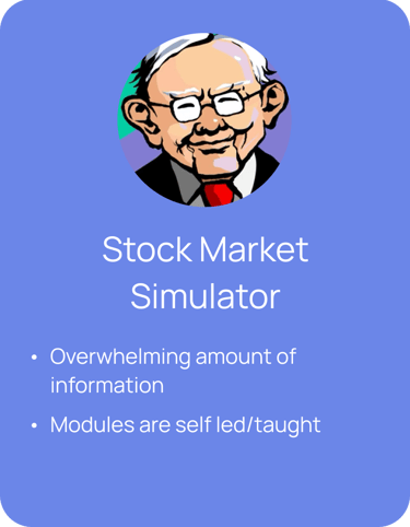

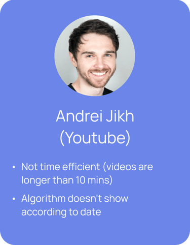
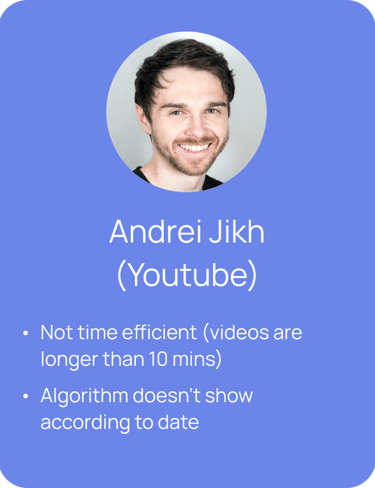
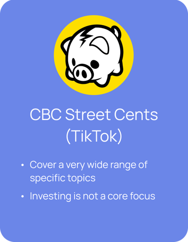

We researched and decided on two direct competitors (InvestMate and Stock Market Simulator) and two indirect competitors (Andrei Jikh, a Youtuber who is a financial content creator and CBC Street Cents, a content creator on TikTok). Here are the brief key findings:
Ideation
The problem statement was reached by analyzing all the information that had gathered so far:
How might we create an engaging and interactive app that empowers teenagers to confidently learn, invest, and build strong financial foundations?
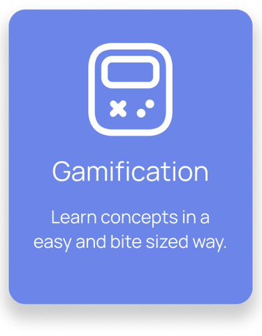
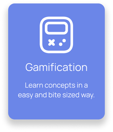
High Impact, High Complexity:
Gamification
AI Chat Box
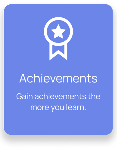
High Impact, Low Complexity:
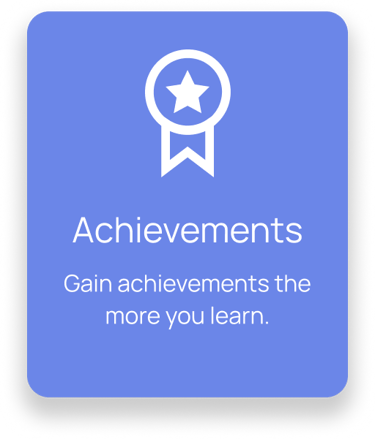
Reward system for learning
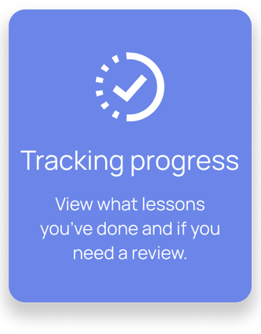
Progress Tracker
Storyboard
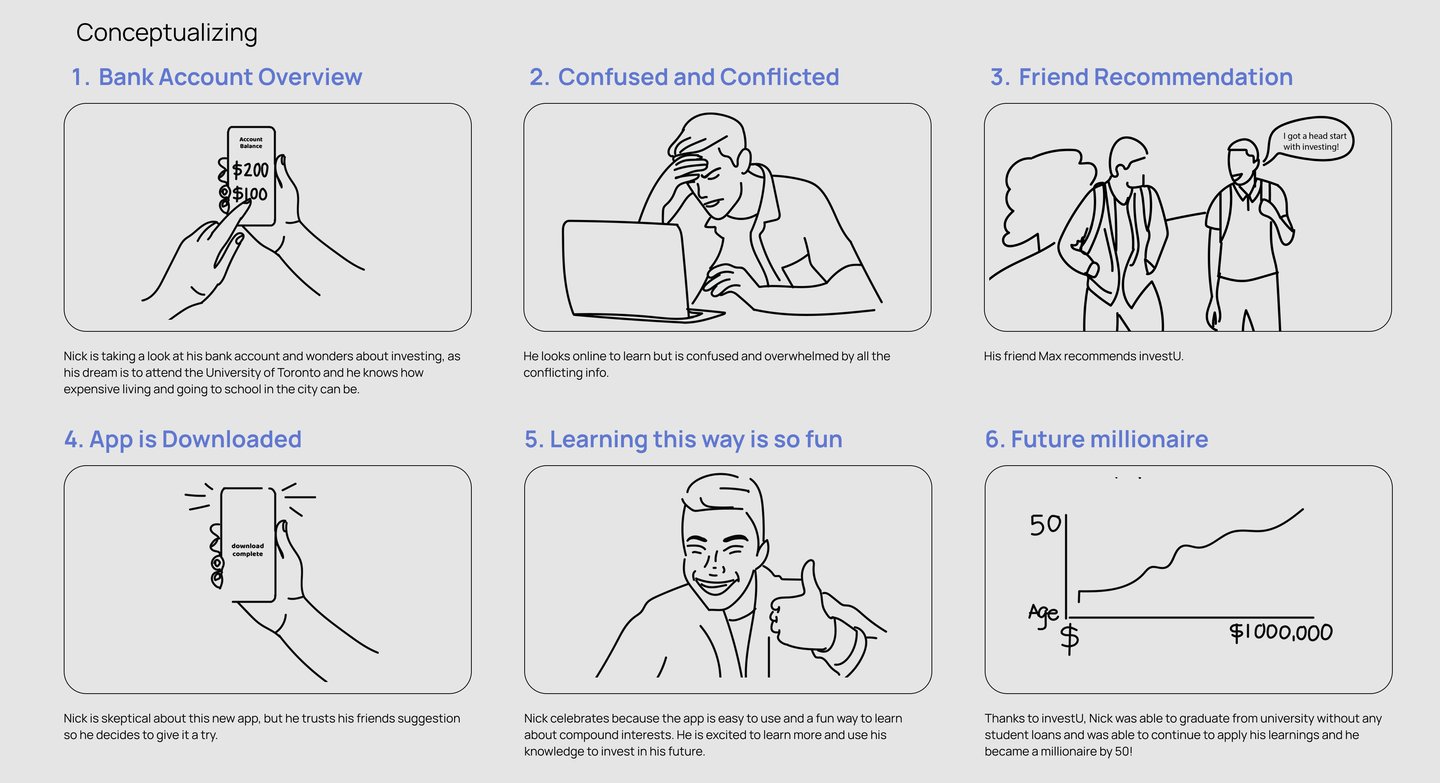
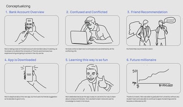
From the problem statement we started brainstorming ideas and putting ideas in a Feature Prioritization Matrix and this is the conclusion:
From ideating, we decided to focus on these three core features, focusing on how we might teach investing to teenagers in a fun way.
Design
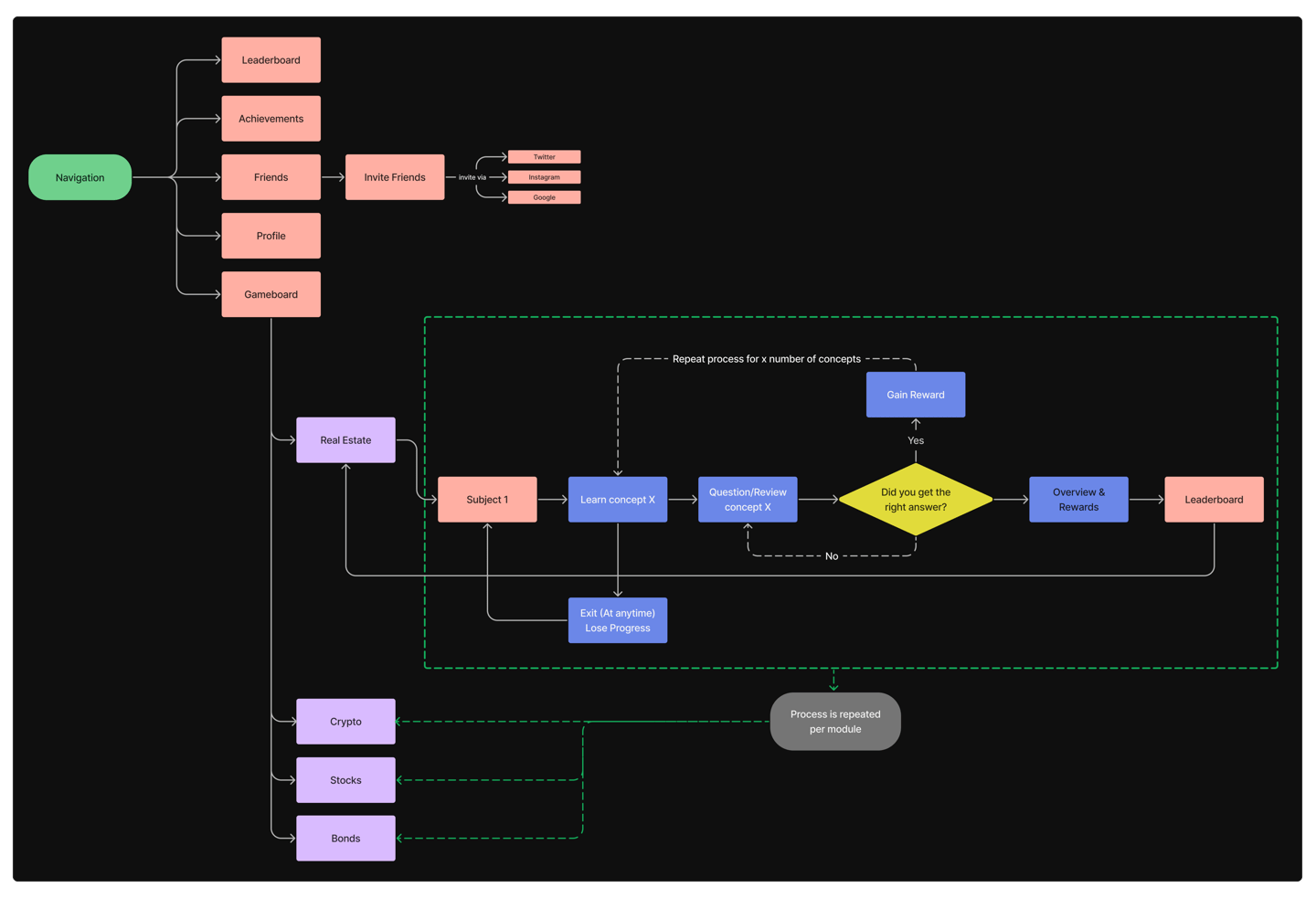
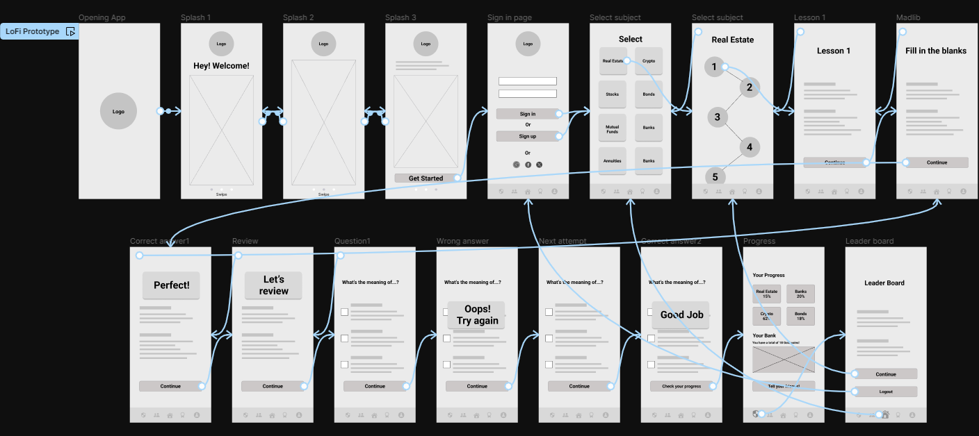
User Flows
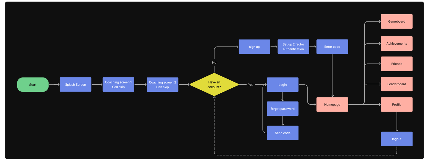
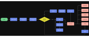
Onboarding to Home Flow
Home to Game Flow
In the next step we imagined how the user would go through the application and created the user flows and iterated them. Here are the two most important user flows:
Sketches
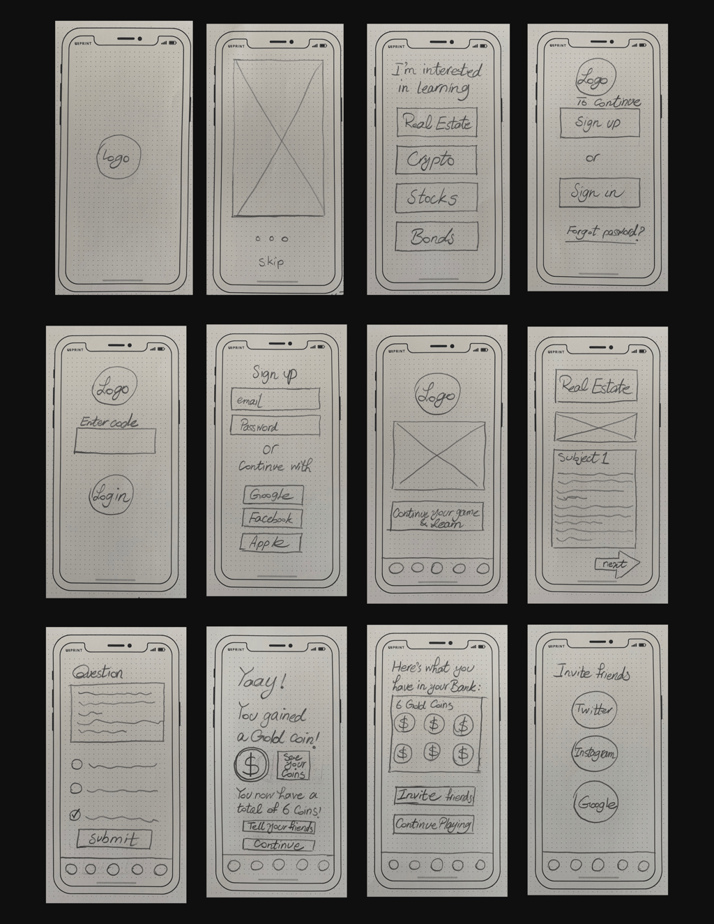
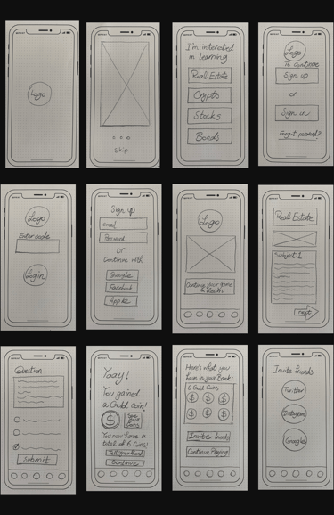
In my initial sketches I explored how game would work and how information could be organized and displayed.
Wireframing
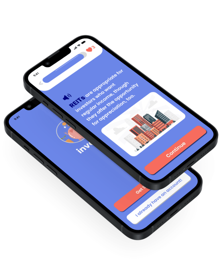
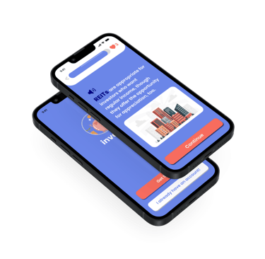
Low Fidelity Prototyping
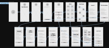
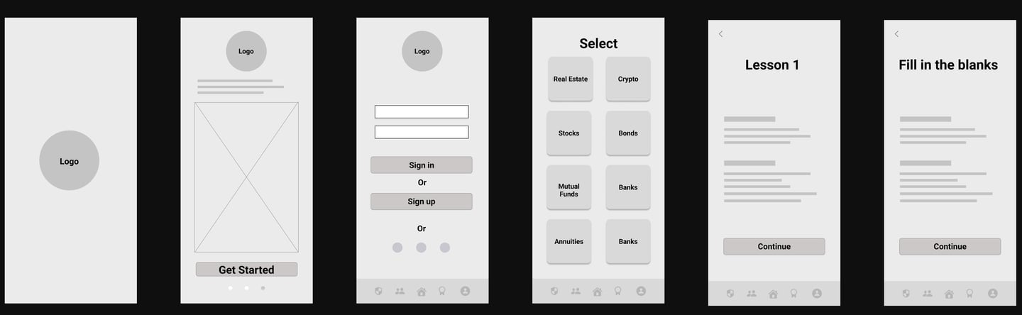
Hi Fidelity Prototype
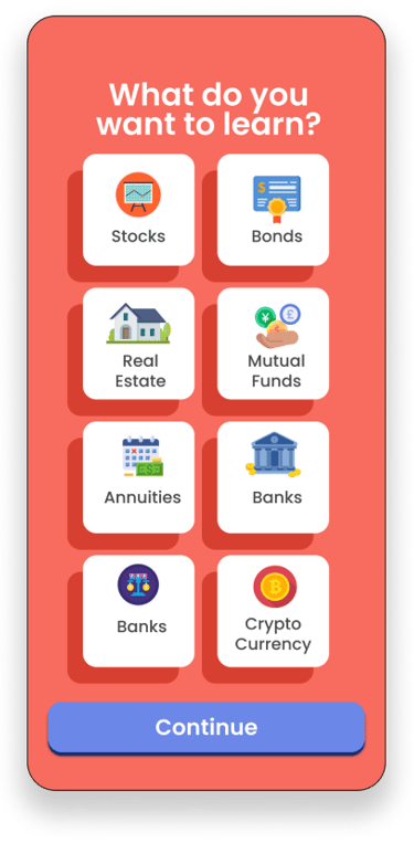
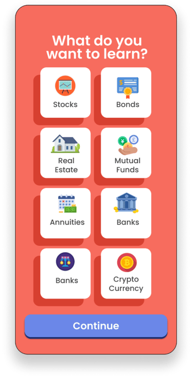
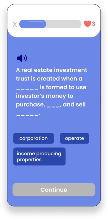
We then moved on to creating Hi Fidelity prototype and focused on two flows:
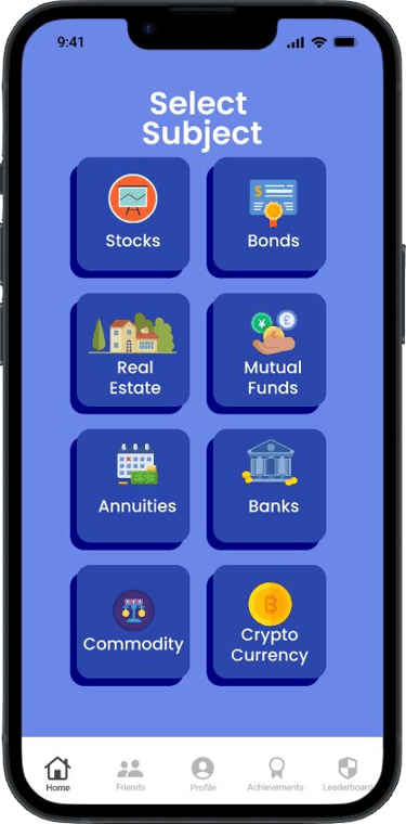
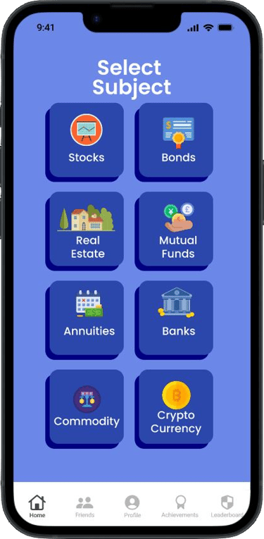
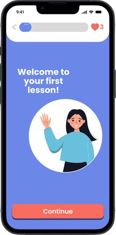
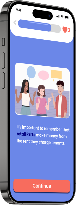
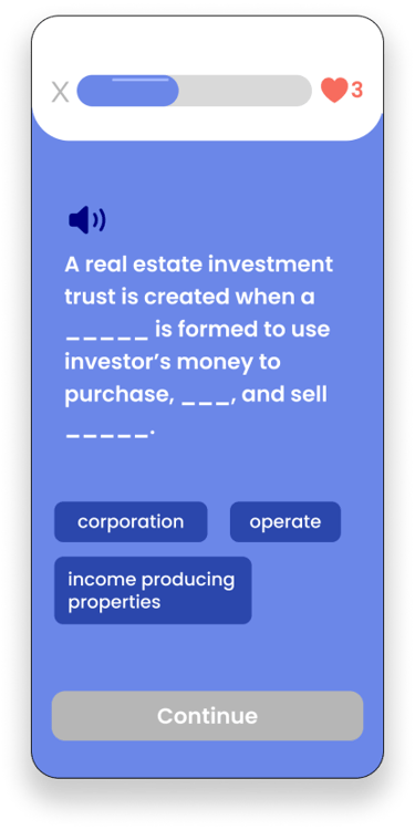
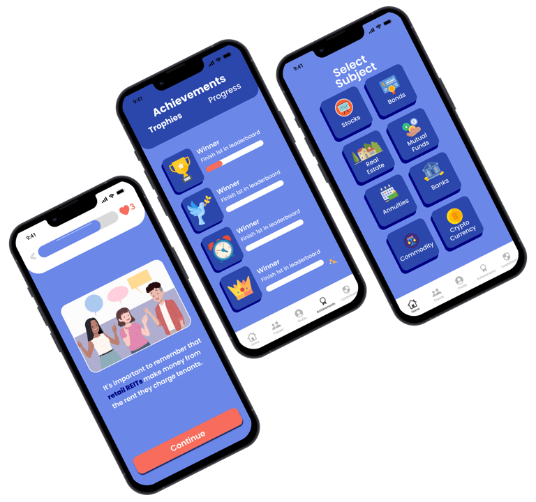
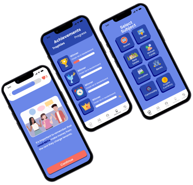
Game flow
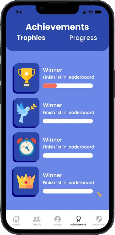
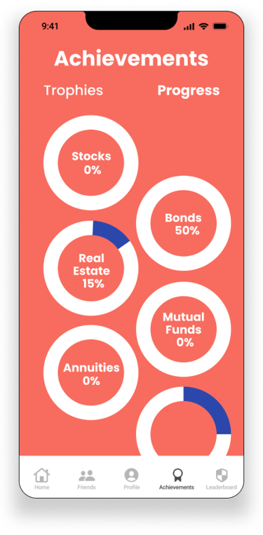
Achievements and progress flow
Iterations after Usability Testing

As well as conducting usability testing with Lo-Fi prototype, we continued testing with Hi-Fi prototype and iterated the design based on the data gathered.
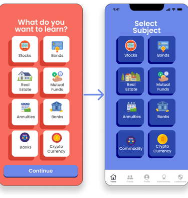
Based on testing we changed this to home screen for better navigation (it was in the onboarding before and user’s found it hard to get back to). We also changed the background color from orange to blue as a result of an A-B testing.
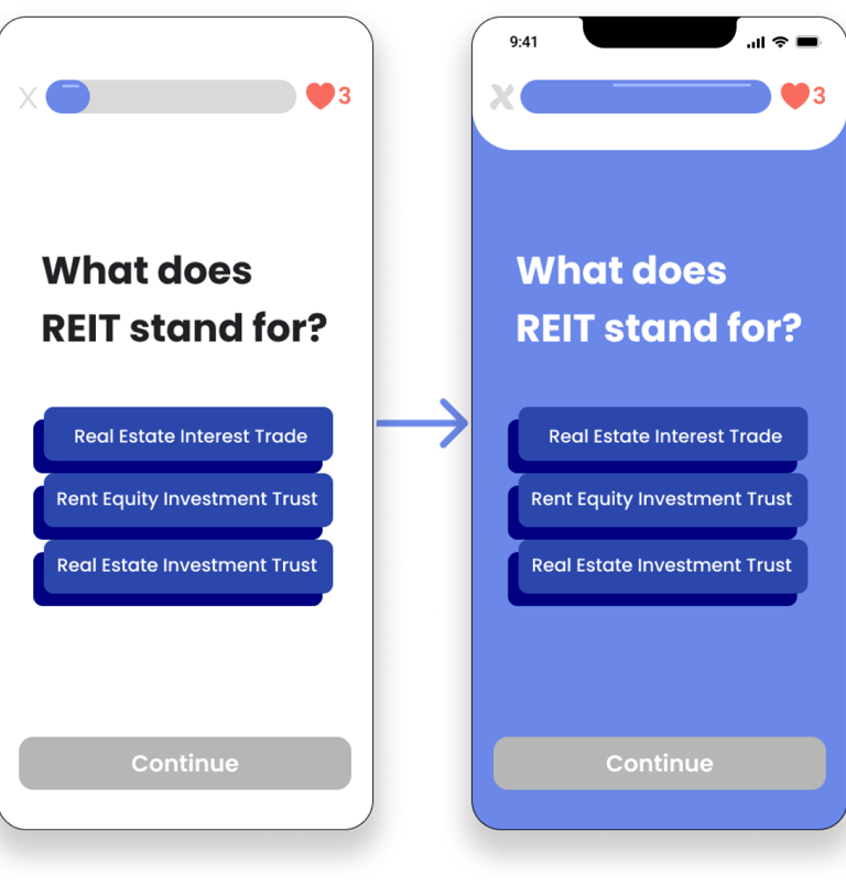
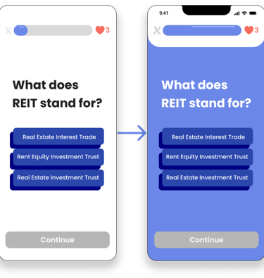
We adjusted the progress bar for the whole game as it used to be reset in the learning phase and question phase which confused users.
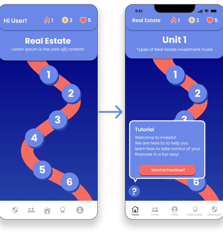
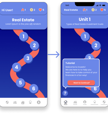
During testing users were confused about mechanics so we added Coaching Pop-ups.
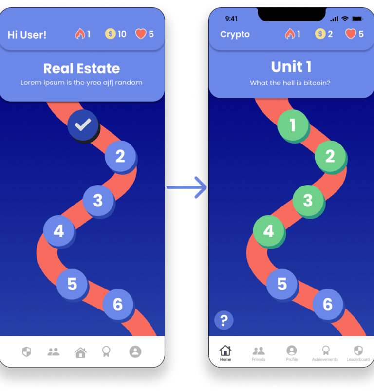
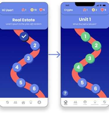
Labelled bottom navigation and showed a clearer indication of when users were completed a level.
Link to Prototype
Next Steps
Do more usability testing for teens including persons with special needs.
Refine current content library.
Reach out to investing experts for feedback.
Takeaways
Collaborate as a team and achieve goals based on our strengths.
Research and creating a strong foundation.
Importance of usability testing and reiterating.
Credits
Shout out to my teammates Rebecca, Daniel, and Neha. It was my pleasure to work with these fabulous people on this project. I enjoyed every minute and learnt a lot!