
ILT Website Redesign
A research-led accessibility redesign for a Toronto non-profit serving people with disabilities, uncovering how outdated navigation and information overload were preventing the most vulnerable users from accessing the support they needed most.
Project Overview
My Role
Lead UX Researcher + UX/UI Designer
Designed two-track interview protocol (stakeholder + user interviews)
Designed and distributed accessibility survey (10 responses)
Conducted 5 semi-structured user interviews
Led website analysis and heuristic evaluation
Conducted competitive analysis (4 organizations)
Led card sorting for information architecture redesign
Conducted usability testing (5 participants, 2 rounds)
Led A/B testing and 5-second tests
The Problem
"The website just doesn't explain anything. I had to call them just to find out what I was looking for." - Survey participant, ILT website user
ILT's website had three core problems that our research uncovered:
Users couldn't find information due to overwhelming navigation and poor content organization, the website had no meaningful accessibility features despite serving users who rely on assistive technologies, and contacting ILT was unnecessarily complicated, creating friction at the most critical moment, when someone needed help.
The website wasn't just outdated. It was failing the very people it was built to serve.
Tools
Figma, Miro, Adobe Illustrator, Google suite, Slack, Zoom
The Centre for Independent Living in Toronto (ILT) is a community-based non-profit that helps people with disabilities learn independent living skills and integrate into their communities. Their mission is powerful: empowerment for people with disabilities, run by people with disabilities.
But their website, built in 2012 and never meaningfully updated, had become a barrier rather than a bridge. For most users, an outdated website is frustrating. For people with disabilities, it can mean losing access to life-changing services.
Introduction
Context - Why this matters
According to Statistics Canada, among the 311,640 deaths recorded in Canada in 2021, 14,448 were caused by nervous system-related diseases, conditions like Multiple Sclerosis, which affects not just physical health but mental health too. Studies suggest clinical depression, the most severe form, is more common among people with MS than in the general population.
Organizations like ILT exist to help people with these conditions live independently and with dignity. When their website fails, it's not just inconvenient, it's people not getting the support they need.
Before redesigning anything, I needed to understand:
How do people with disabilities and their caregivers navigate online resources?
What specific barriers does the ILT website create for its users?
What assistive technologies do users rely on, and does the website support them?
What information do users most urgently need, and can they find it?
Research
I designed a comprehensive stakeholder interview protocol to speak directly with ILT staff about their website goals, user personas, and pain points. Despite multiple outreach attempts, we were unable to secure an interview with the organization.
What this meant for our research: We adapted by relying on a thorough heuristic evaluation of the existing website combined with user interviews and survey data. This limitation is worth noting, as direct stakeholder input would have added valuable organizational context to our findings.
Research Goals
Research Track 2: Accessibility Survey (10 responses)
Research Track 1: Stakeholder Interviews (Attempted)
I designed and distributed an accessibility-focused survey to understand how users experienced the ILT website.
Key Findings
The website scored an average of 2.5 out of 5 for overall accessibility
70% of respondents encountered difficulties navigating the main menu
80% wanted visual design improvements, citing small text, confusing icons, and poor color contrast
The website scored 1 out of 5 for font legibility among keyboard navigation users
Multiple respondents had to call ILT because they could not find what they needed online
One respondent specifically noted the menu button was too small for users with fine and gross motor disabilities
No accessibility features were found for users with vision impairments
Research Track 3: User Interviews (5 participants)
I designed a semi-structured interview protocol and conducted 5 interviews across two groups: people with disabilities and their caregivers, and general adult internet users to understand broader web navigation patterns.
Interview 1: Jeannie (caregiver for multiple family members with disabilities)
Jeannie's family includes members with autism, spinal fusion, dementia, and arthritis. She was navigating DSO* applications and passport** funding for her daughter who was diagnosed with autism at age 19.
* DSO stands for Developmental Services Ontario, it's a government program in Ontario that connects people with developmental disabilities to funded services and supports.
** Passport is a government funding program in Ontario specifically for adults with developmental disabilities. It gives them money to purchase the supports and activities they need to live more independently and participate in their community.
Key insights:
She had never heard of ILT despite actively searching for disability resources
The application process felt disconnected and overwhelming, with no guidance on steps or sequence
Her daughter and husband use text-to-speech technology; she navigates by keyboard
She described needing a website that would "walk me through the processes, step by step"
She wanted checklists that explained not just what to do, but why
This interview directly inspired our "New to Diagnosis" category in the redesigned information architecture, one of the most significant research-to-design connections in the project.
Interview 2: Sam
Key insights:
Strongly preferred online booking over phone calls ("I could see the times right at my fingertips")
Found live chat highly valuable for quick answers without calling
Navigated primarily through Google, going directly to sources
Found calendar-based interfaces most helpful for time-based tasks
Interview 3: Tasneem (recent graduate)
Key insights:
Judged website credibility by visual appearance: "if it looks sketchy or scammy, I won't trust it"
Found contacting organizations frustrating: "I just wanted to reach them and they weren't letting me"
Suggested clear sectioning, subtitles, and scannable content
Interviews 4 and 5: Helen & David
Key insights:
Both preferred mobile for quick searches, laptop for in-depth research
Found categorization and chunked information essential for navigation
Preferred sites that linked back to credible sources
Valued table of contents and clear headers for scanning
High contrast important for accessibility


Affinity Diagram & Thematic Analysis
After completing all 5 interviews, insights were organized into an affinity diagram to identify patterns across participants. Six clear themes emerged:
Theme 1: Info Chunking: Users across all interviews wanted information broken into clearly labeled, scannable segments rather than large blocks of text.
Theme 2: Credibility: Users judged trustworthiness by visual design, source linking, and reputation. A poor-looking website made them question the organization itself.
Theme 3: Too Much Information: Information overload was a universal pain point. Users wanted clarity and prioritization, not comprehensiveness.
Theme 4: Pain Points: Key frustrations included restarting processes due to errors, the more specific a search the harder to find, and passport/DSO funding processes being inaccessible online.
Theme 5: Contacting is Hard: Multiple participants described difficulty reaching organizations, including ILT specifically. Users wanted fast, simple contact options.
Theme 6: Search Methods and Devices: All users started with Google. Mobile for quick lookups, desktop for in-depth research. Saving via bookmarks or screenshots.
These themes directly shaped our 5 Actionable Design Features:
Content Chunking
Credibility
Guidance
Easy Way to Connect
Categorization.


Competitive Analysis (4 organizations)
Direct competitors:
OCL (Ontario Community Living): well-structured website with relevant links easily accessible. Focuses specifically on developmental disabilities, which allows more tailored content than ILT's broader scope.
LIFE Program (March of Dimes Canada): simple, easy to navigate, programs clearly found. Serves only young adults aged 15-30, a much narrower audience than ILT.
Indirect competitors:
Ability Online: an online community for people with disabilities. Easy to navigate, simple menus, information found quickly. Focused on connection rather than services.
ALS (Accessible Learning Services, George Brown College): logical information categorization, good font sizes, legible. Only serves GBC students with disabilities.
Key gap identified: ILT serves ALL types of disabilities across ALL age groups, a broader mission than any competitor. But the website communicated none of this breadth or strength. Every competitor that performed well had clear navigation, simple menus, and logical content groupings. ILT had none of these.

User Persona
Goals
To be happy and feel safe.
To have up to date activities and fieldtrips.
To be taken care of according for her certain needs.
Make friends with other members.
Pains
Hard to find trustworthy centers that will cater to her needs.
Concerned how much it will cost.
Worried about finding good people to make friends.
Activities are usually outdated.
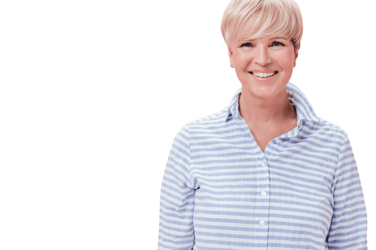
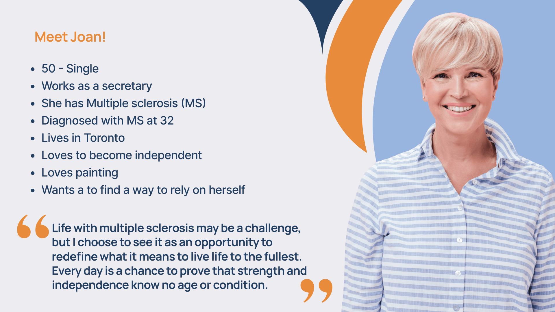
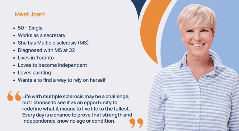
Based on research findings, Joan was developed. A 50-year-old Toronto woman living with Multiple Sclerosis who uses a wheelchair for mobility. She is organized, moderately active, and wants desperately to live independently. She volunteers at local charities and loves painting, but is finding that her MS symptoms are worsening with age.
Joan's goals: find trustworthy programs for her specific needs, access up-to-date activities and events, connect with a supportive community.
Joan's pain points: hard to find trustworthy centers that understand her needs, concerned about costs and eligibility, current website content is outdated, contacting the organization requires too many steps.
Storyboard
To bring Joan's journey to life for our team and stakeholders, I contributed to a storyboard that traced her path: Joan's symptoms worsen, a friend recommends ILT's newly redesigned website, she finds information about Wheel-Trans, applies successfully, and feels empowered by how easily she found what she needed. This storyboard grounded every design decision in a real human outcome.


KEY FINDINGS & PAIN POINTS
Finding 1, Navigation caused critical task failure 4 out of 5 usability testing participants could not find the "Aging with a Disability" page, an 80% failure rate on a critical task. The navigation was too complex and tertiary pages were invisible without extensive exploration. Pain Point: Users felt lost and frustrated, often giving up entirely. For someone with a disability navigating a healthcare-adjacent resource, giving up is not a neutral outcome.
Finding 2, Information overload and poor content organization Too much text with no clear hierarchy made it impossible to scan and find relevant information quickly. Pain Point: Users felt overwhelmed and confused, with several noting that they would simply leave the site rather than persist through disorganized content.
Finding 3, Critical accessibility gaps The website lacked support for keyboard navigation, text-to-speech, and voice commands, despite serving users who depend on these tools daily. Survey rated font legibility 1 out of 5. Pain Point: Users with disabilities felt excluded by the very organization designed to help them.
Finding 4, Contacting ILT was unnecessarily difficult Multiple participants across survey and interviews reported difficulty finding how to contact ILT. One survey respondent confirmed they had to call just to find basic information. Pain Point: At the most critical moment, when a user needed help, the website created friction instead of connection.
Finding 5, Visual inconsistency undermined trust The website was described as "patchwork" with no coherent design system. Users judged credibility by visual appearance and the current design made ILT look unreliable. Pain Point: New users, with no prior knowledge of ILT, had no reason to trust the organization based on the website alone.
Finding 6, No guided pathways for complex processes Caregivers and first-time users navigating disability services had no structured guidance through complex application processes like DSO applications or passport funding. Pain Point: Users described filling in forms "blankly and hoping it leads somewhere", a deeply disempowering experience for people already navigating difficult circumstances.
Problem Statement
For individuals with disabilities and their caregivers who are searching for independent living resources and support in Toronto, the current ILT website creates more barriers than it removes. Poor navigation, information overload, lack of accessibility features, and difficulty contacting the organization prevent users from accessing the programs and services they urgently need.
HMW Statement
How might we design an inclusive and empowering platform for individuals with disabilities that helps them find the information, programs, and support they need to achieve greater independence in their daily lives?
Homepage

Design Process
Every decision below traces directly to a research finding. Research drove design, not the other way around.
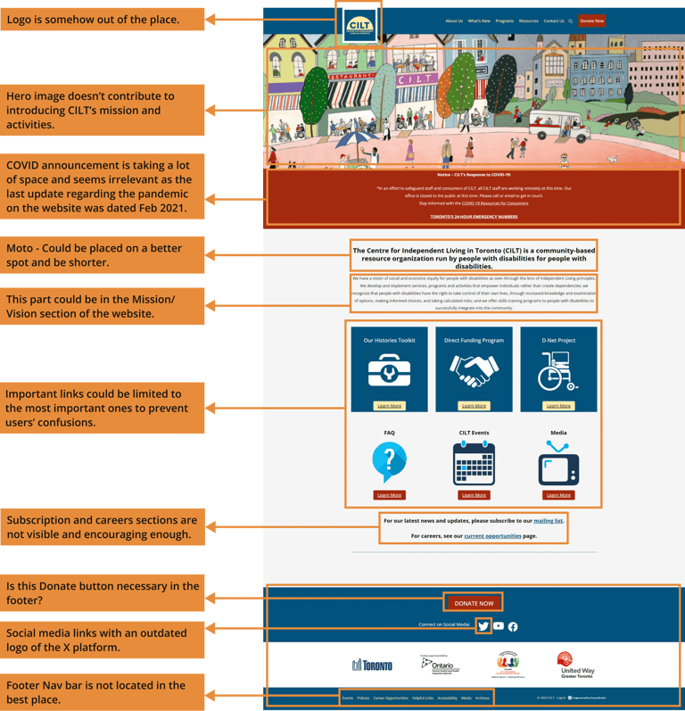
Poor information architecture: pages were disorganized and difficult to find, with no logical grouping.
Recommendation: redesign the information architecture to group pages under easy-to-find labels.
Difficult to process content: walls of text with no chunking or clear hierarchy.
Recommendation: content chunking and labelling to allow easy scanning.
Lack of hierarchy: no clear visual hierarchy to guide users through the page.
Recommendation: clear buttons and links to important actions and sources.
Step 1: Website Analysis & Heuristic Evaluation
Before speaking to users, I analyzed the existing ILT website and identified three core structural problems:
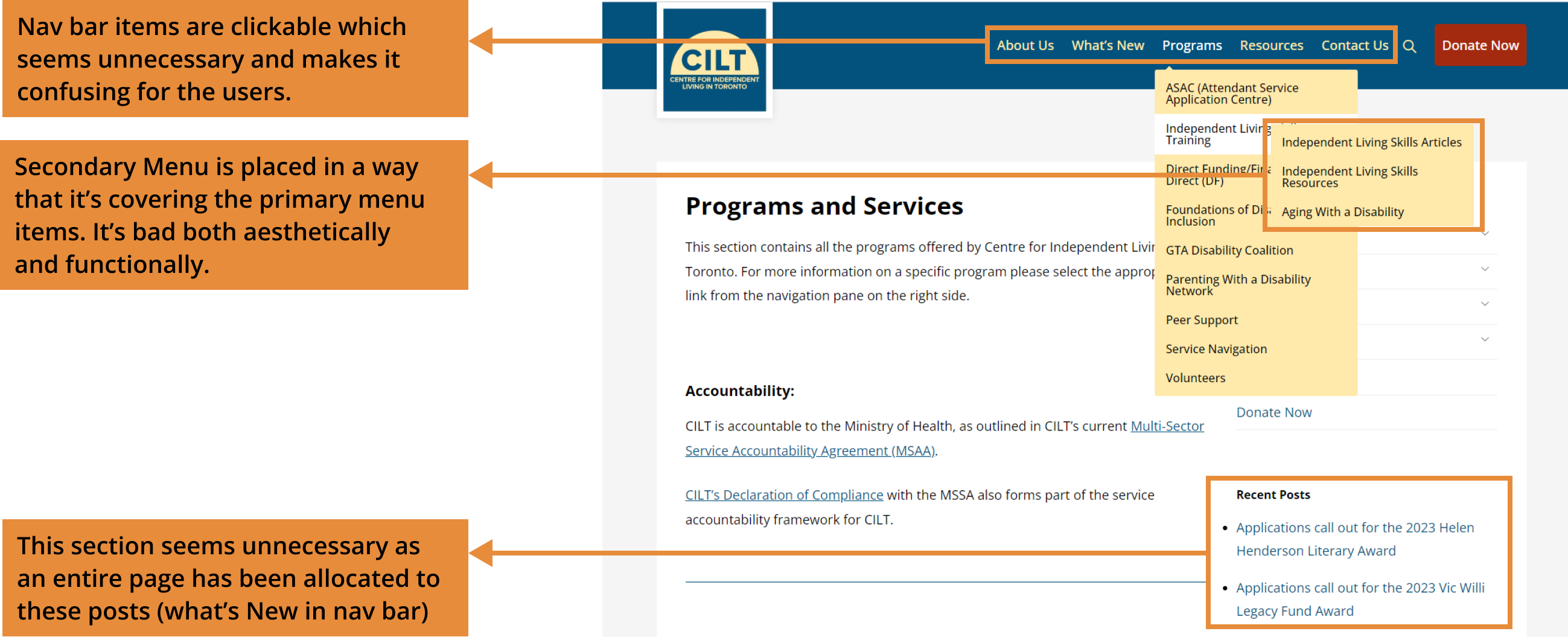
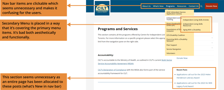
Programs Page
Step 2: Information Architecture (Card Sorting)
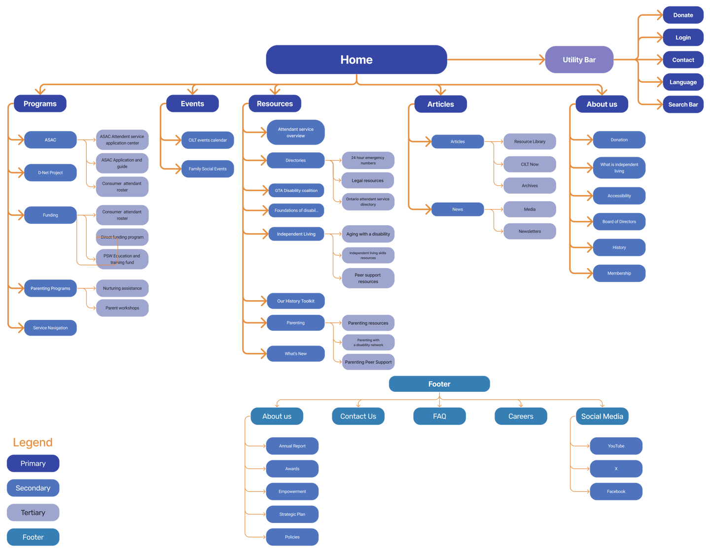
Research finding that drove this: 4 out of 5 users couldn't find the "Aging with a Disability" page. Users expected content grouped logically by their needs, not by the organization's internal structure.
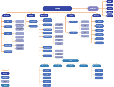
I used card sorting to understand how users naturally organize ILT's content. The exercise produced a completely restructured sitemap with six primary navigation categories: Programs, Events, Resources, Articles, About Us, and a Utility Bar.


Step 3: Task Flows
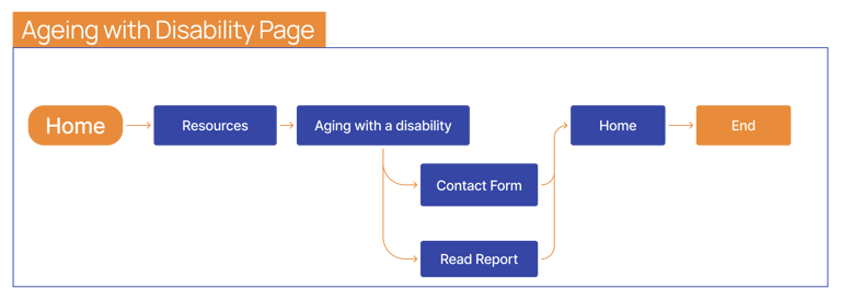
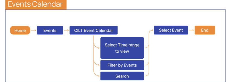
Research finding that drove this: Users needed clear, step-by-step pathways. Complex tasks like donating, finding aging resources, and registering for events had no guided flow.
I designed task flows for three priority journeys based on what research identified as users' most critical needs:
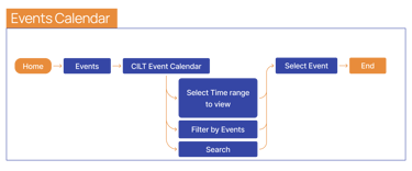
Events Calendar: select time range, filter by event type, search, register
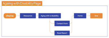
Aging with a Disability: home, resources, aging page, read report or contact form
Donation Form: start, frequency, funding option, dedication, complete
Each flow was designed to minimize steps and eliminate dead ends, directly addressing the navigation failures observed in research.
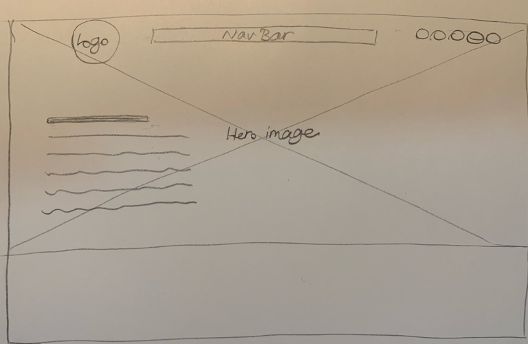
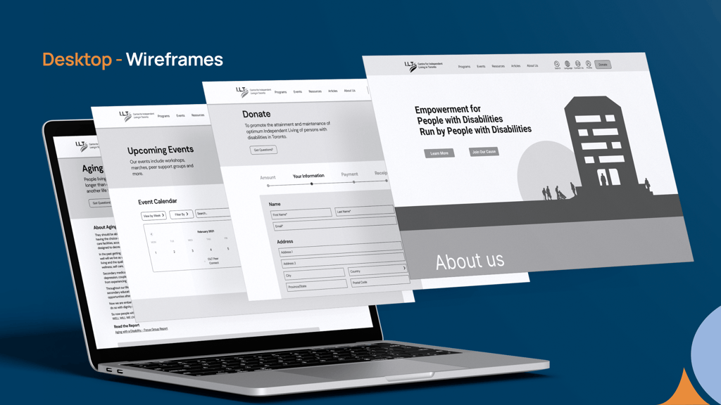
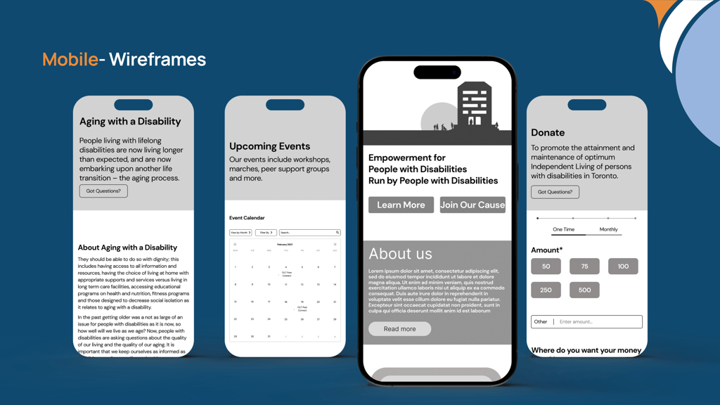
Step 4: Sketches & Wireframes (3 Iterations)
Research finding that drove this: Users wanted clear organization, visible mission, and reduced cognitive load from the moment they landed on the homepage.
I designed three iterations of the homepage wireframe:
Iteration 1: Added a clear organizational slogan so users immediately understood what ILT does. Reduced button size to avoid overwhelming users.
Iteration 2: Added a relevant illustration and clear CTAs ("Learn More", "Join Our Cause"). Made text and buttons smaller for better visual balance.
Iteration 3: Replaced the illustration with a real photograph to create human connection. Made section heights smaller to reduce scrolling. This decision was grounded in research showing users build trust through authentic visual representation.
Both desktop and mobile wireframes were designed simultaneously, ensuring accessibility across devices from the start.
Step 5: Navigation Iterations (2 Rounds)
Research finding that drove this: 4 out of 5 users couldn't find tertiary pages. Navigation caused the highest failure rate of any element we tested.
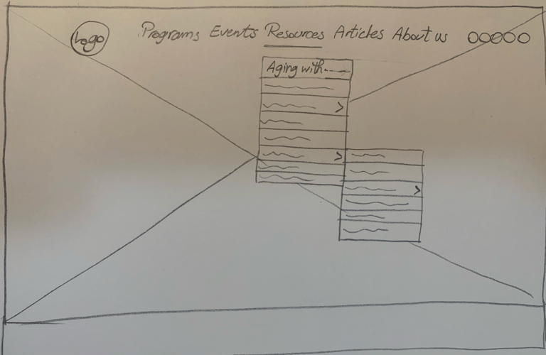
I iterated on the navigation design twice before testing:
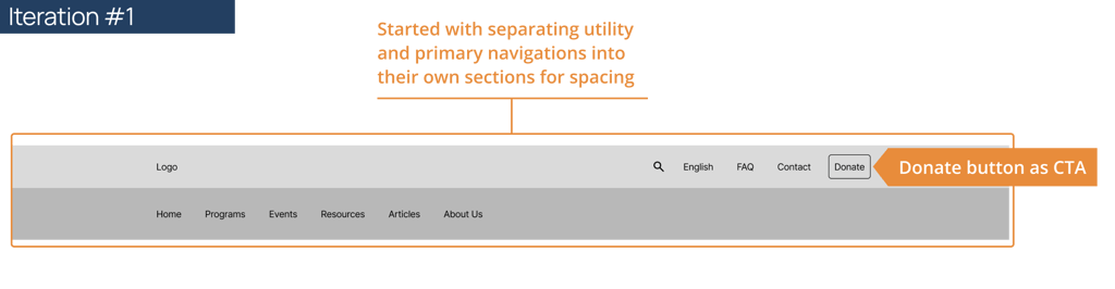
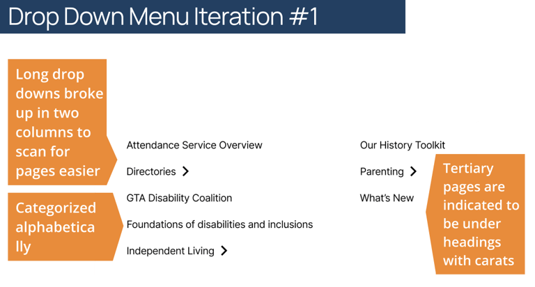
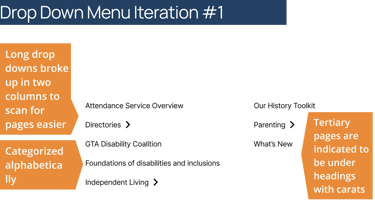
Iteration 1: Separated utility and primary navigation into distinct sections. Organized dropdown items alphabetically. Used two-column dropdown layout for easier scanning.
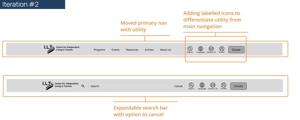
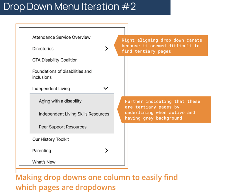
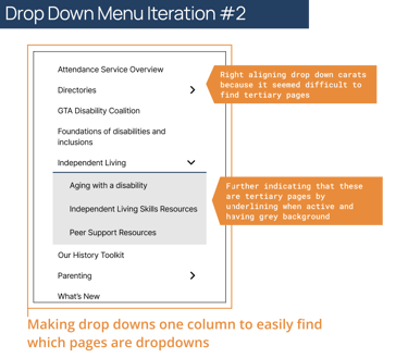
Iteration 2: Moved primary nav with utility for better space efficiency. Added labeled icons to differentiate utility from main navigation. Right-aligned dropdown carats to make tertiary pages more discoverable. Added grey background to highlight expanded menu state.
Dropdown Menu Iterations
Step 6: Usability Testing Round 1 (5 participants: Forbes, Nikhil, Tammy, Sumathi, Ben)
I conducted the first round of usability testing with 5 participants across 3 tasks: registering for a CILT event, finding the Aging with a Disability page, and completing a donation.
Critical finding: Aging with a Disability: 80% failure rate 4 out of 5 participants could not find this page. This was the single most important finding from testing and directly drove a complete navigation restructure. → We redesigned tertiary page visibility by right-aligning dropdown carats and adding visual indicators for expandable sections.
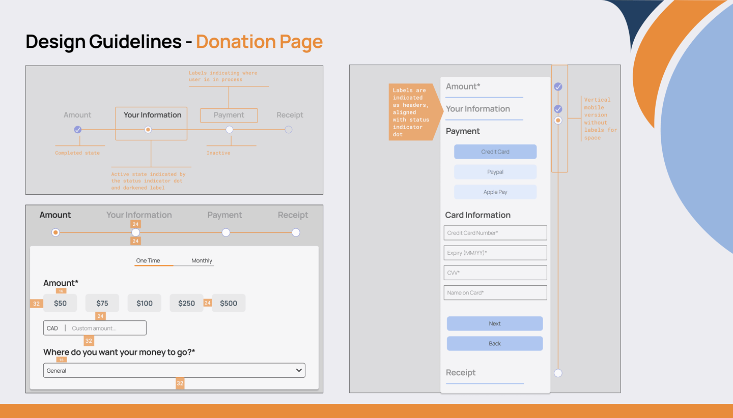
Finding: Donation flow confusion Multiple participants couldn't find the donate button (wished it was bigger), got confused by the "Back" button at the end of the donation flow, and wanted pre-set donation amounts rather than an open text field. → We added pre-set donation amounts ($50, $75, $100, $250, $500), changed the final "Back" button to "Back to Home", added a print/save PDF option on the receipt, and added three clear states to the donation progress tracker: Active, Next, and Finished.
Finding: Events Calendar interaction Users wanted to click directly on calendar events to register, wanted filter options, and found the calendar visual relationship between dates and the event list unclear. → We improved the visual connection between calendar dates and the event list, and clarified the registration interaction.
Finding: Homepage text too large Homepage text was consistently flagged as oversized, creating a poor first impression. → We reduced homepage text sizes and section heights.
Finding: Navigation icons caused confusion Icons in the utility navigation didn't have universal meaning, causing users to hesitate or misclick. → We removed all utility navigation icons and replaced them with clear text labels. A visual line was added to separate utility from main navigation.
Step 7: A/B Testing & 5-Second Tests
After the first round of usability testing, we conducted A/B tests and 5-second first impression tests to validate specific design decisions.
A/B Test 1: Donate section image We tested a cropped image vs a full-width image in the homepage Donate section. Result: Users preferred the cropped image. It felt more intentional and less overwhelming. → We implemented the cropped image layout.
A/B Test 2: Button styling We tested a filled "Contact Us" button vs an outlined "Contact Us" button alongside the "Donate" button. Result: Users were more inclined to click "Donate" when "Contact Us" was an outlined secondary button. → We implemented the outlined "Contact Us" button to create a clear visual hierarchy between primary and secondary actions.
Step 8: Design System
Research finding that drove this: Visual inconsistency made users distrust ILT's legitimacy. One survey respondent described the website as "patchwork."
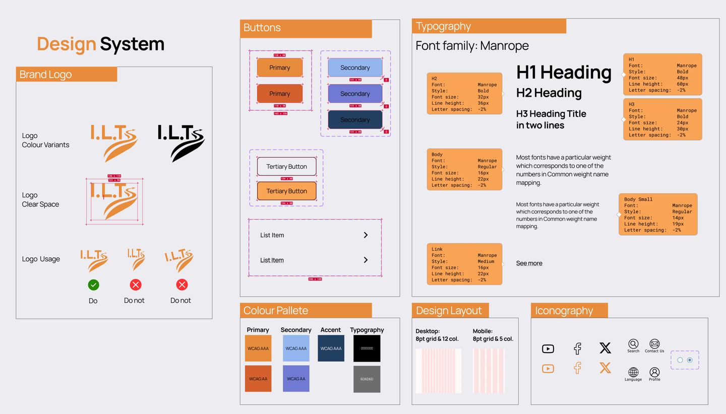
I contributed to a comprehensive design system built around three core principles derived from research: Accessible (easy to find and use), Approachable (user-friendly, never intimidating), and Simplified (not overwhelming or complicated).
Key design system decisions:
Color palette: All colors tested against WCAG AAA and WCAG AA accessibility standards. Orange was chosen over the previous light yellow because user testing consistently noted the old color lacked impact and confidence.
Logo redesign: We updated the organization name from C.I.L.T. to I.L.T. based on direct user feedback that "CILT" sounded inappropriate. The new logo uses an orange road/path motif representing progress and direction, chosen after testing multiple concepts with users.
Typography: Manrope font family throughout. H1 at 48px, H2 at 32px, H3 at 24px, Body at 16px with 22px line height. All sizes designed for legibility and accessibility.
Layout: 8pt grid system. Desktop: 12 columns. Mobile: 5 columns.
Step 9: Hi-Fi Prototype
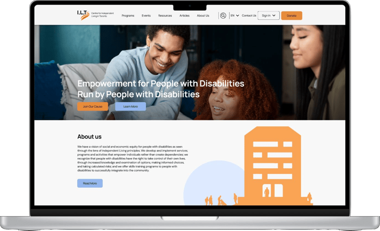
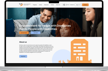
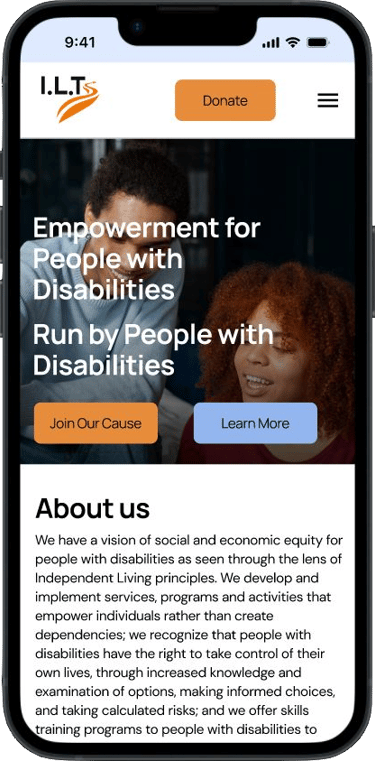
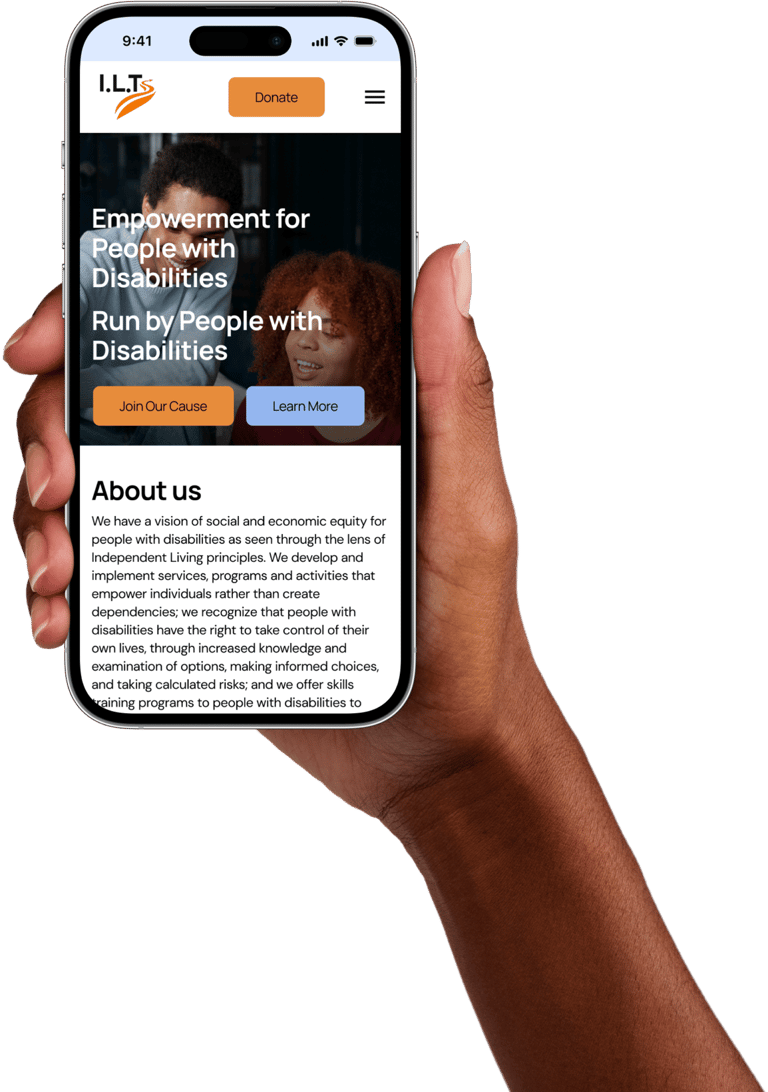
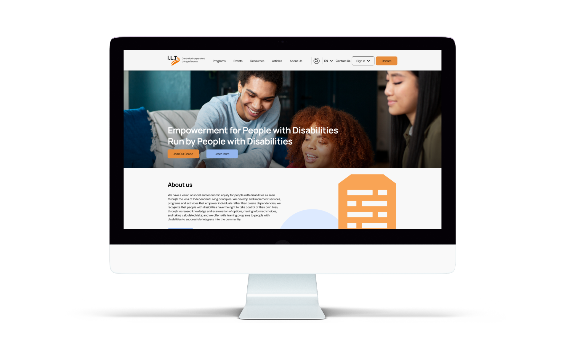
The final hi-fi prototype was delivered for both desktop and mobile, bringing all research-driven decisions together into a fully realized, accessible design. The redesigned homepage leads with a clear organizational mission ("Empowerment for People with Disabilities, Run by People with Disabilities"), real photography for human connection, and immediate access to key programs and the donation flow.
Delivery
Click on each device to see the prototype!
Next Steps
What this project taught me as a researcher:
Designing for vulnerability requires extra empathy. The people using this website are navigating some of the most challenging circumstances of their lives. Every friction point has real consequences, a person not getting support they urgently need. That made every research decision feel important.
Accessibility must be built in from the research phase, not added at the end. By centering accessibility in our research questions, interview recruitment, and survey design, we ensured it shaped every design decision rather than being retrofitted later.
Caregivers are users too. Research revealed that family members and caregivers were often the primary website users on behalf of people with disabilities. Designing only for people with disabilities themselves would have missed a critical and underserved user group.
Test early, test often, and take failure seriously. An 80% failure rate on a critical navigation task in Round 1 testing was alarming, and exactly the kind of finding that justifies the research process. Without testing, that failure would have shipped.
When you can't reach stakeholders, document it. Our inability to interview ILT staff was a limitation, but acknowledging it honestly is part of rigorous research. We adapted our methodology and were transparent about what we could and couldn't know.
Name changes are UX decisions. Changing "C.I.L.T." to "I.L.T." based on user feedback was one of the most unexpected research-to-design outcomes. It shows that UX research can surface insights that go far beyond screen design.
LESSONS LEARNED
Conduct usability testing with a wider range of disabilities, particularly users with visual impairments, cognitive disabilities, and severe motor disabilities, to validate our accessibility decisions with the people most affected
Implement and test live chat functionality: directly addressing the "contacting is hard" finding from multiple interview participants
Measure real-world impact: track whether the redesign actually improves users' ability to find programs and services, using analytics and follow-up user research
Strategic partnerships: partner with disability advocacy organizations to diversify funding and expand community reach
Disability awareness campaigns: initiate public awareness initiatives to help more people like Joan discover ILT before they reach a crisis point
Credits
This project was a team effort in every sense. Special thanks to my teammates Daniel Fong, Sunny D Bajaj, and Josie Petruska for their dedication to this meaningful project, and to the research participants who generously shared their experiences with us.
And to Joan — our persona and our north star throughout the entire design process. Every decision we made, we asked: would this help Joan? 🌸