Project Overview
The Problem
The main problem was that Aquanure’s website was not not achieving the desired level of online traffic and sales, primarily due to its lack of good design.
The Solution
We believed that a complete redesign of the site was necessary to align with the company's sales goals and to enhance the user experience.
My Role
UX Researcher UX/UI Designer
Tools
Figma, Miro, Google suite, Flair, Slack, Zoom
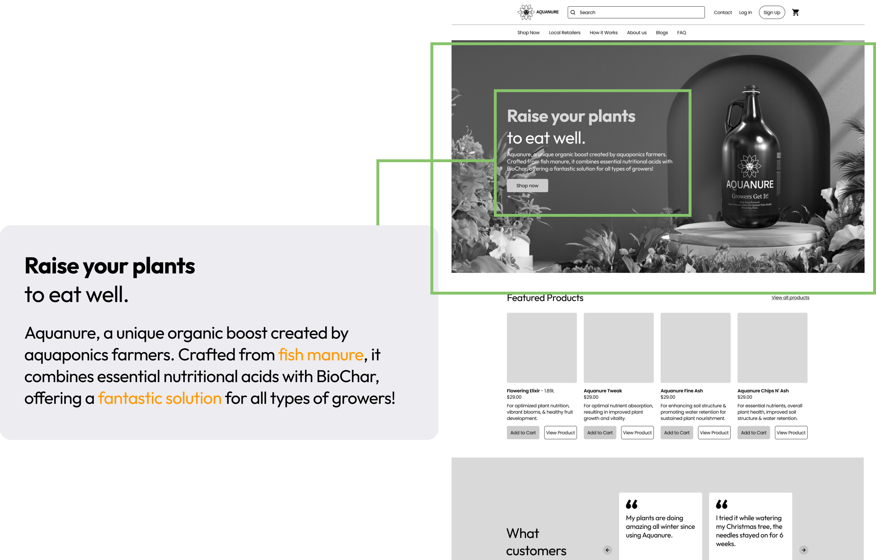
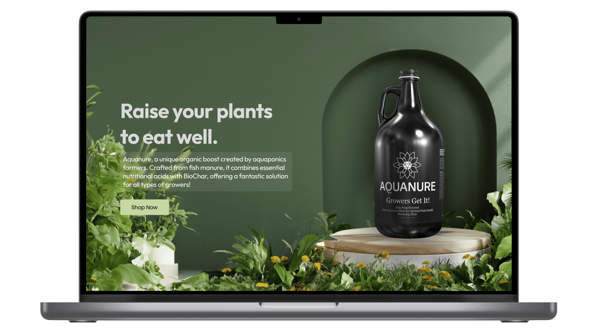
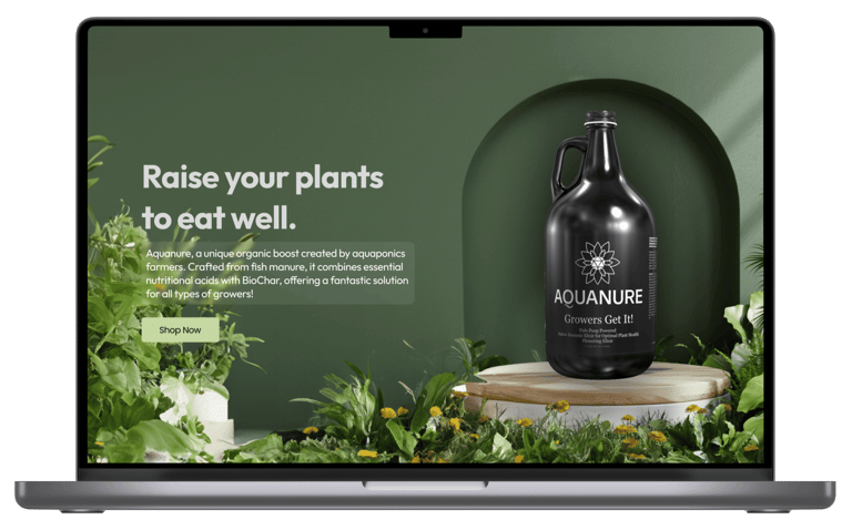
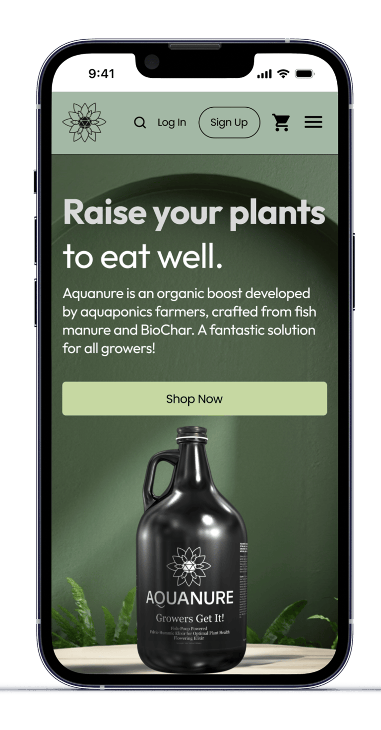
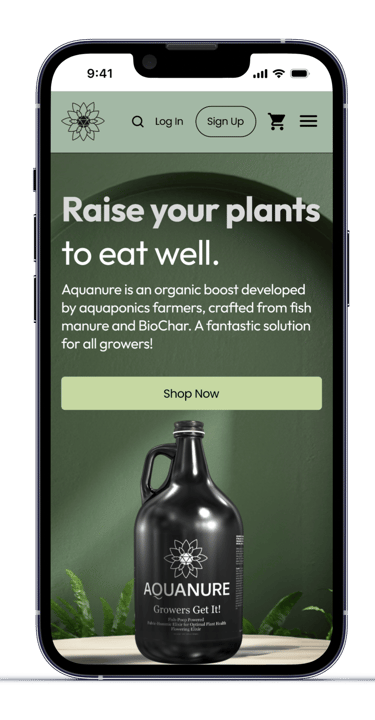
Aquanure is a unique organic boost from aquaponic farmers blends fish manure, vital nutrients, and soil elements for potent fertilizer mix.
Introduction
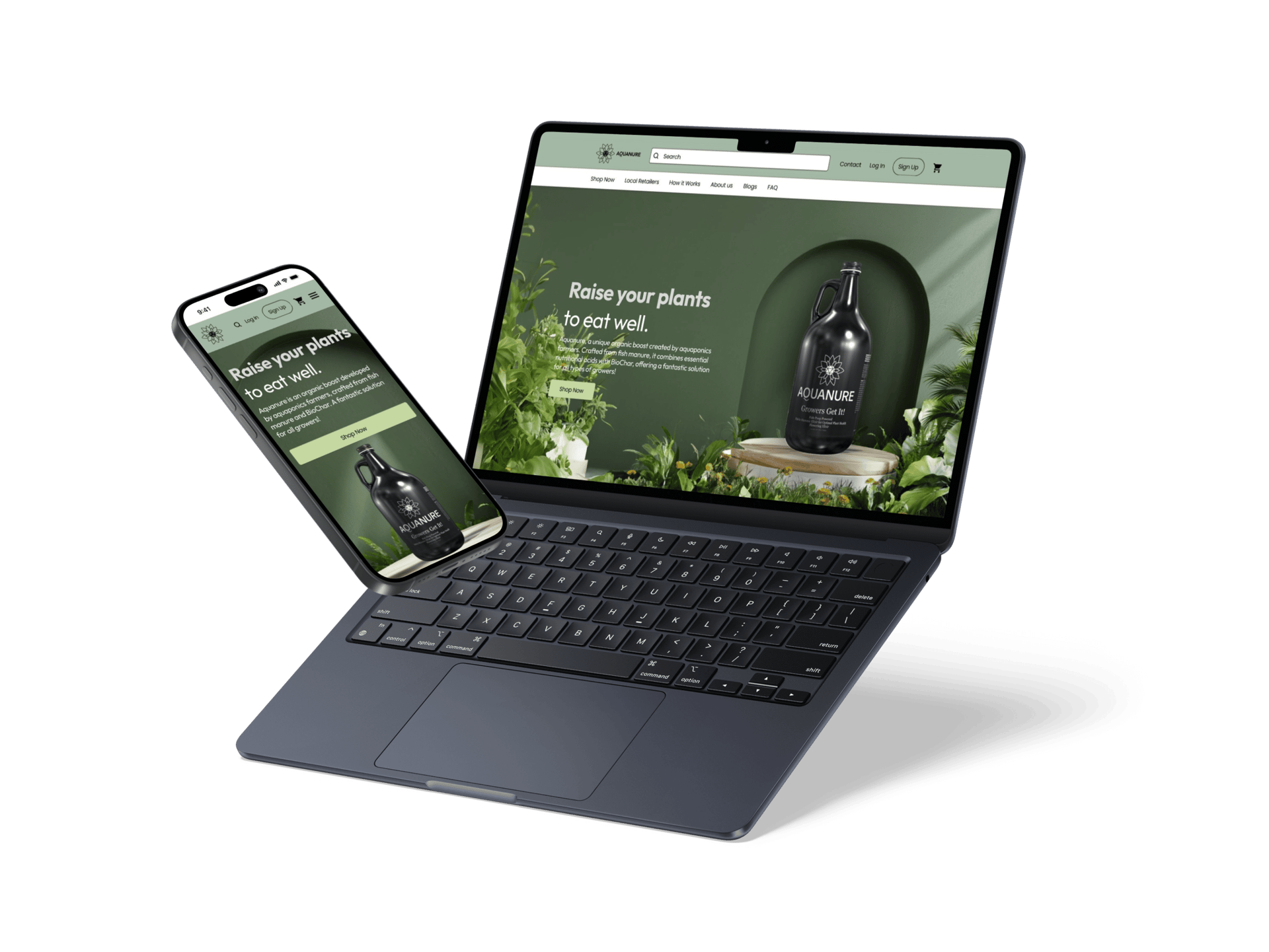
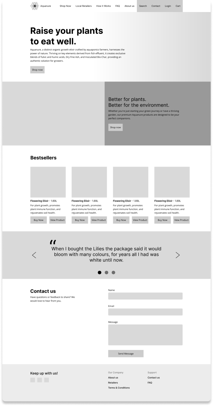
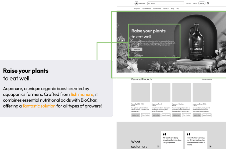
Homepage

Design Process
1. Analyze
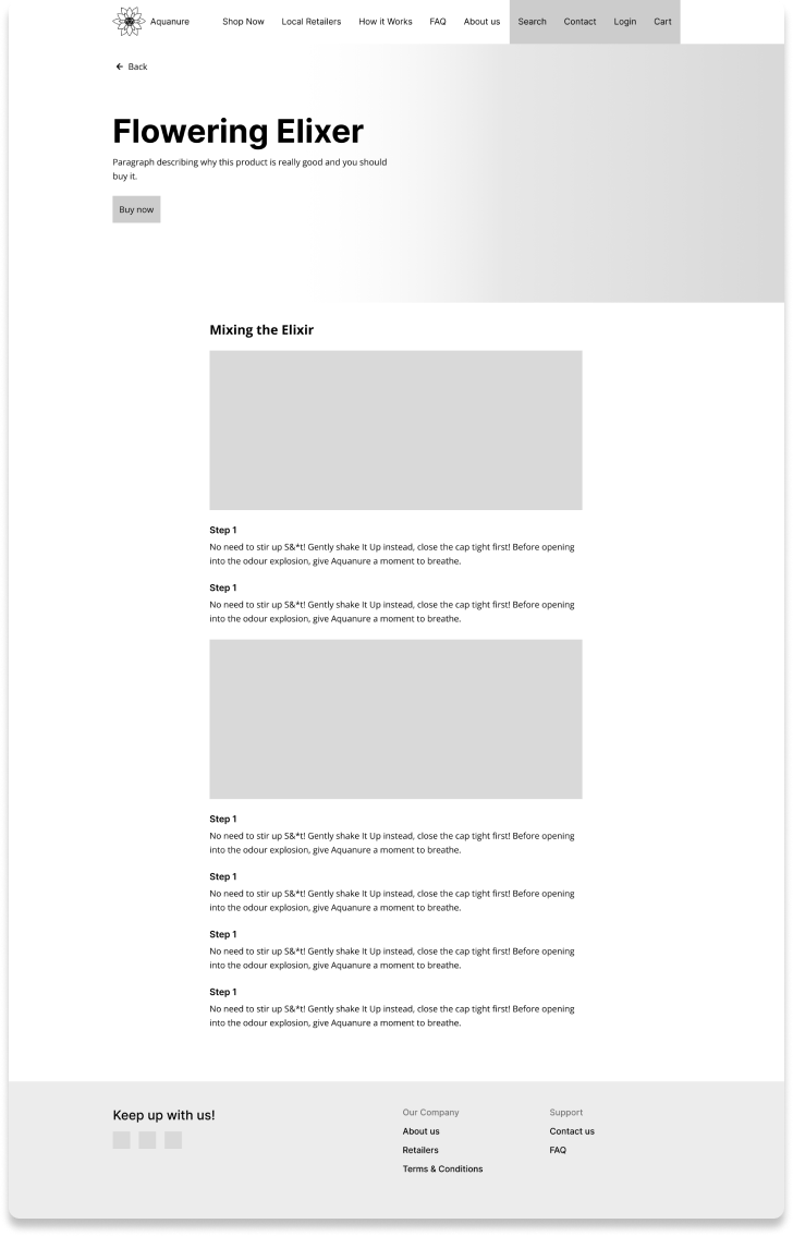
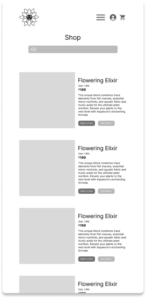
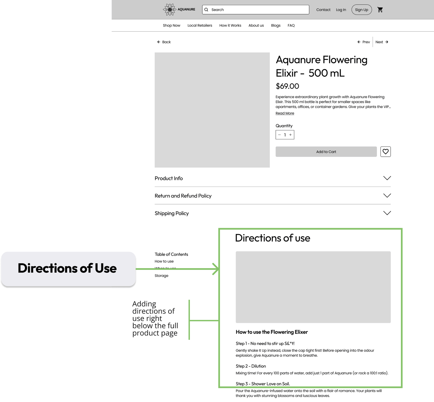
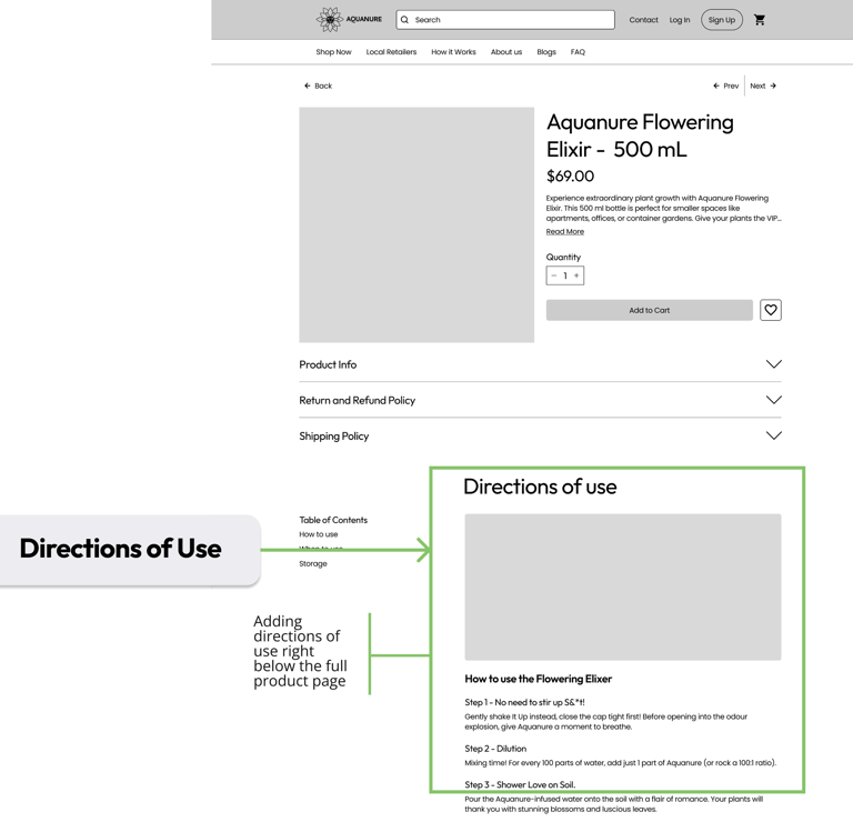
Product Page
2. Research
We had several meetings with Rob, the co-founder and main stakeholder of Aquanure. During our meeting with him, we concentrated on prioritizing our inquiries and gaining deeper insights into the issue. Additionally, we
Interview Plan
After meeting with the stakeholder, we crafted the interview questions to ensure alignment with the stakeholder's directives. Most of our inquiries centered around critical UI sections of the site and identified issues, as well as strategies for redesigning based on user insights
conducted user interviews to enhance our understanding of how users interact with and navigate through the Aquanure website.
and shopping behaviors. We also delved into whether individuals in the plant community are aware of using fish manure as fertilizer, considering it is the primary ingredient utilized by Aquanure.
Key findings from the interviews
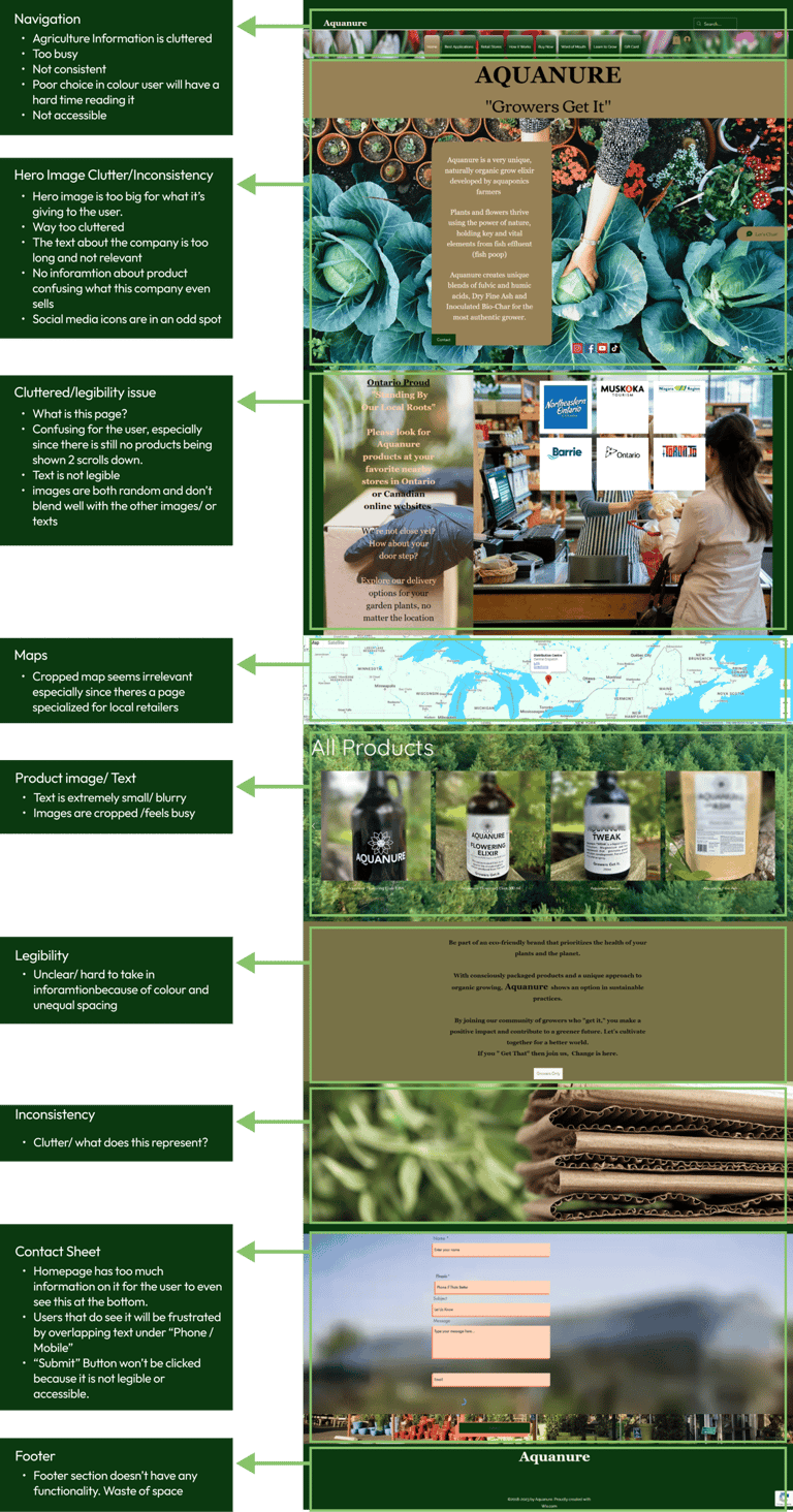
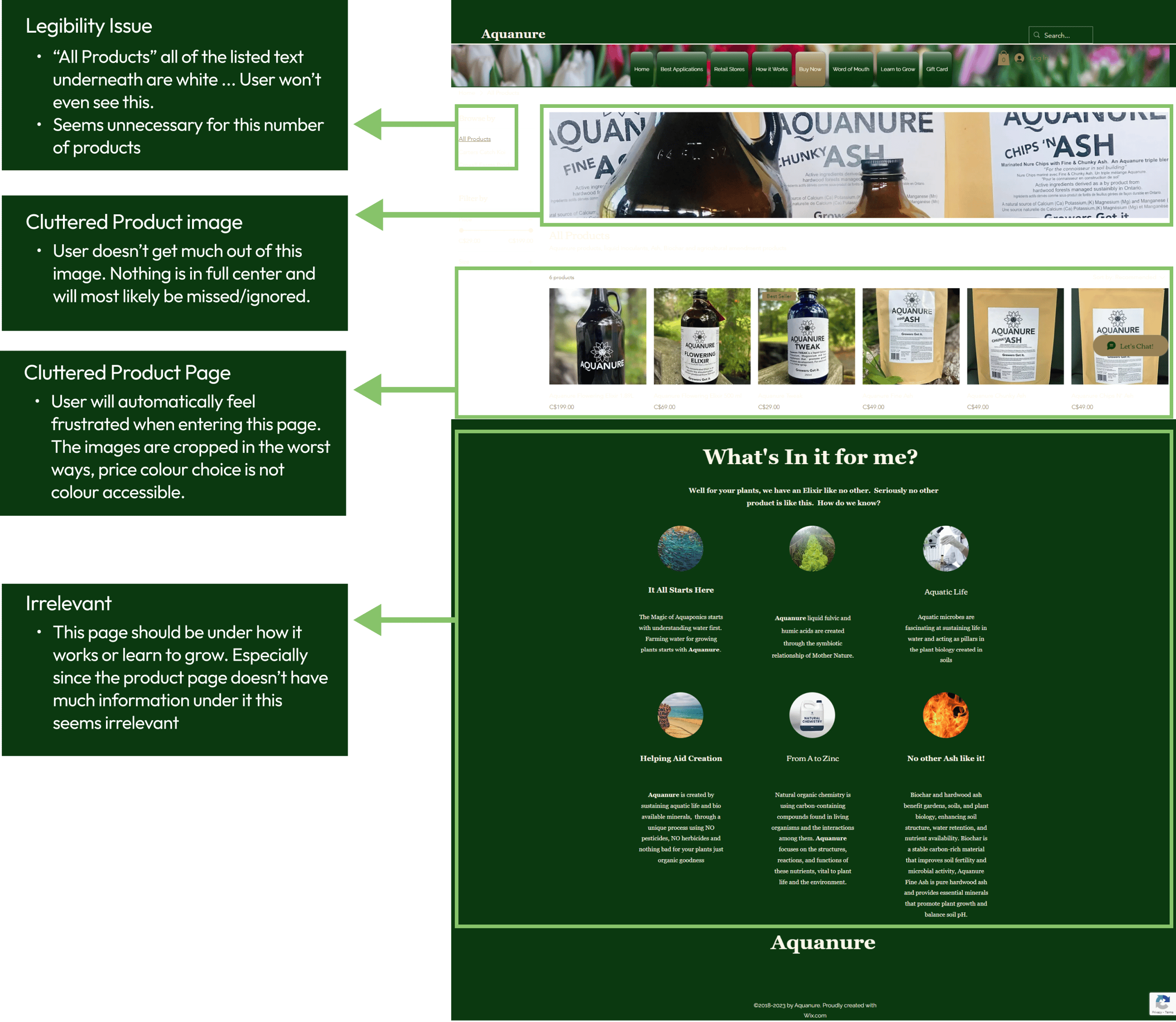
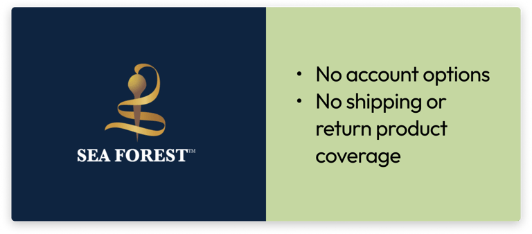
Most users were not aware of the featured ingredient, and did not know that fish manure was even a concept for fertilizer. 100% of users were confused and conflicted when trying to process the checkout options, as legibility was non-existent. In terms of general shopping habits for plant items, a lot of users shopped in stores and usually always went to the same retailers as they were familiar with the product, price and how to use it.


Pain Points
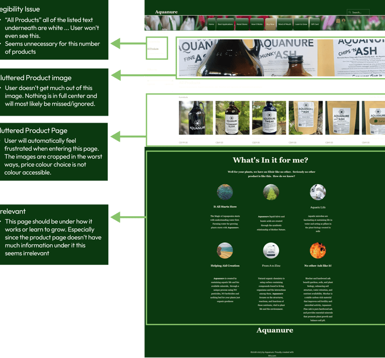
Lack of Clarity
Users faced difficulties in comprehending the information displayed on the website.
Users found it hard to read and understand the text, resulting in frustration.
Readability Challenges
Inconsistency
Users were greatly distracted by the lack of consistency. These issues collectively contributed to a 64.3% bounce rate and no online sales.
HMW Statement
How might we improve Aquanure’s UX/UI so that customers can successfully purchase Aquanure products online?
Design Principles
Accessibility
Providing Guidance
Providing a quality experience
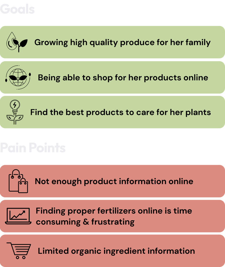
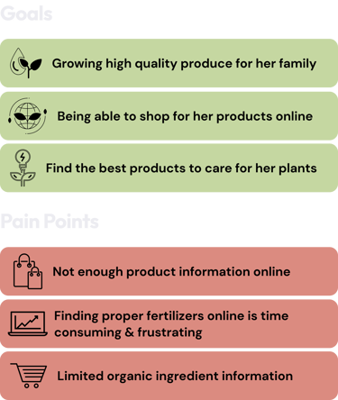
User Persona


Competitive Analysis
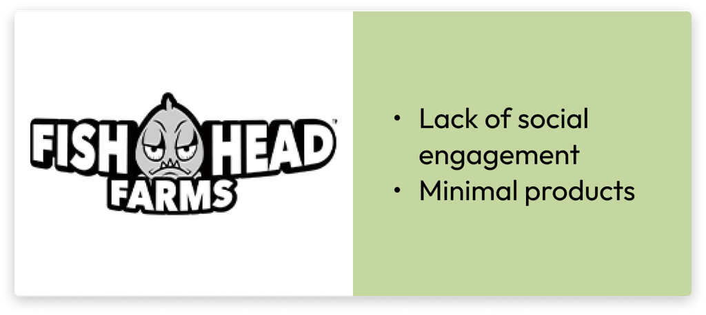


After creating the persona, the main competitions were found and research was done. Here is a brief:
3. Ideation & Design
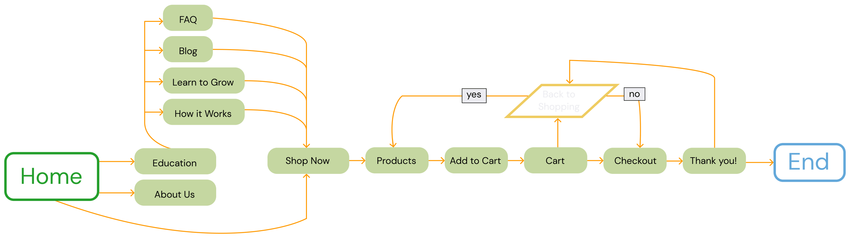
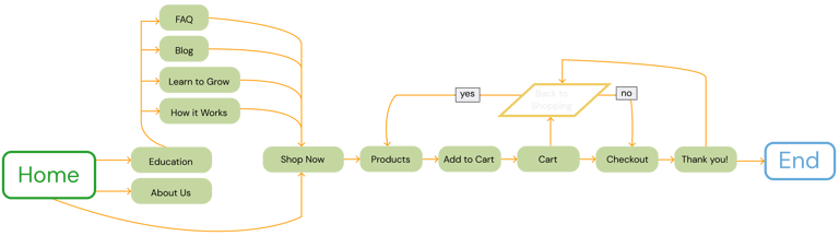
Now it was time to start ideating. Considering all the research and users needs, the user flow was crafted:
User Flow
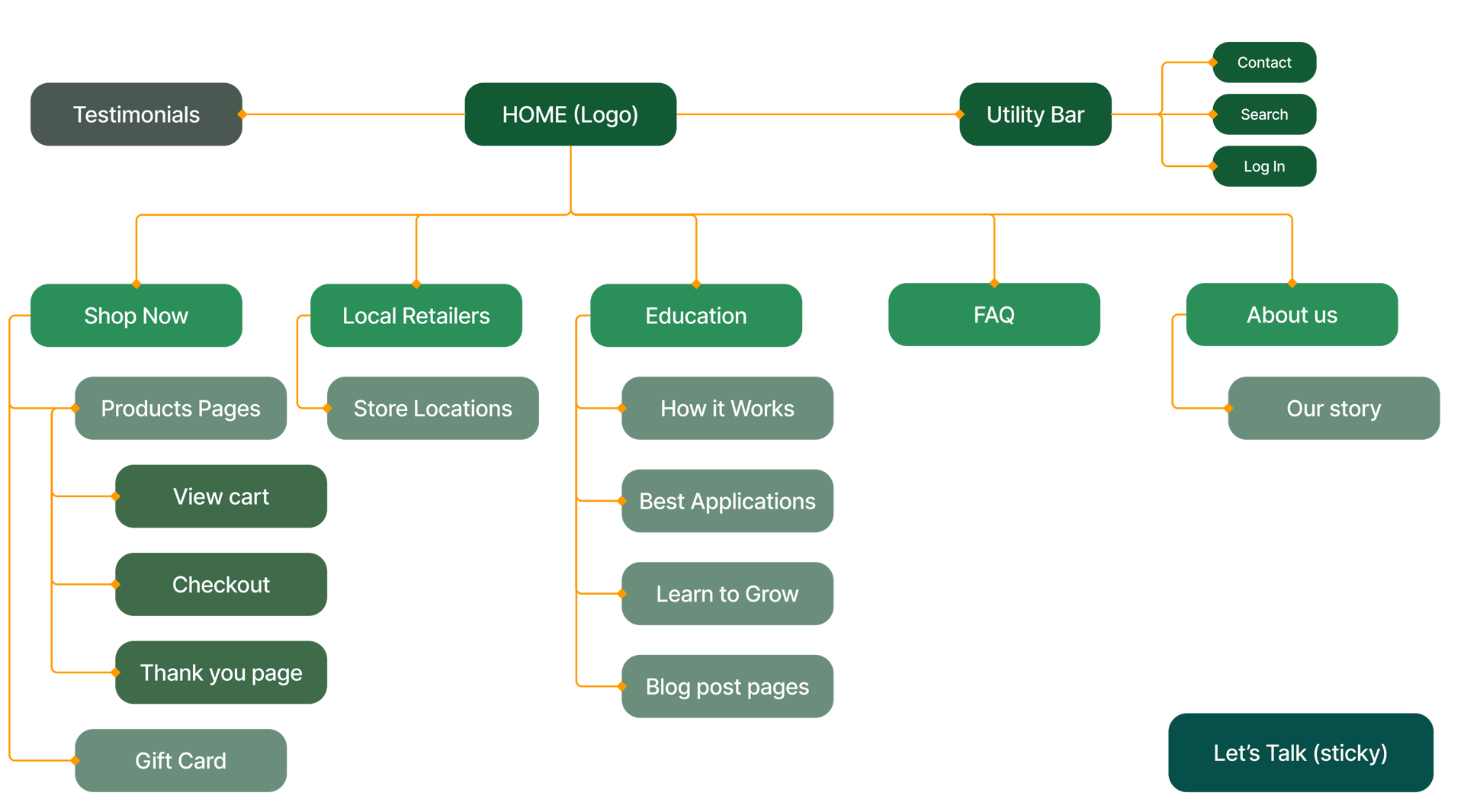
Redesigning Information Architecture
The Card Sorting technique was used to enhance the organization and categorization of Aquanure's website information architecture.
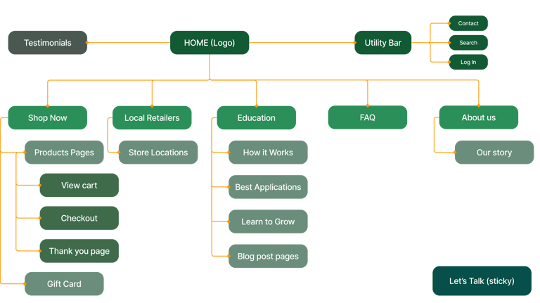
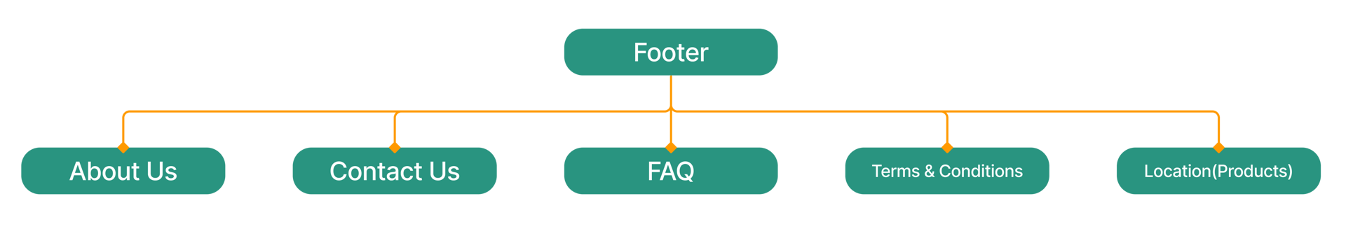
Sitemap
The outcome
Is a revised sitemap that categorizes pages based on their relevance to both the company and the user.

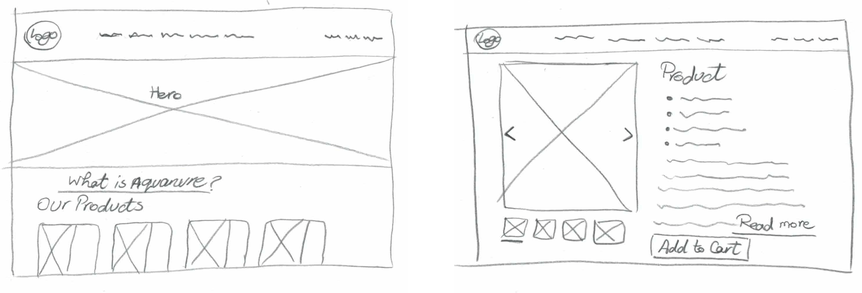
Sketches
In my sketches I tried to imagine what would the user like to see/do based on all the information gathered so far.
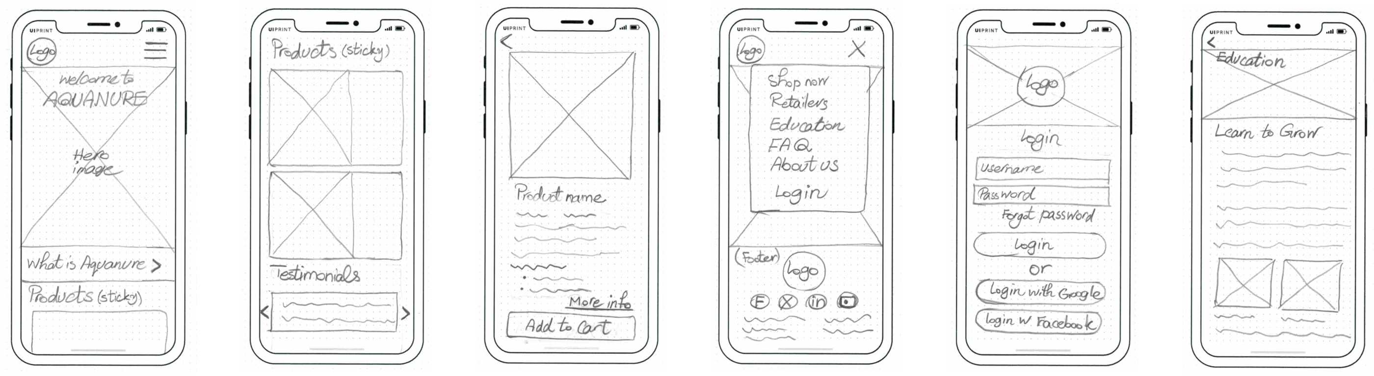
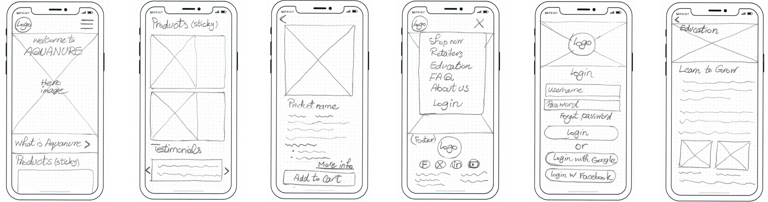

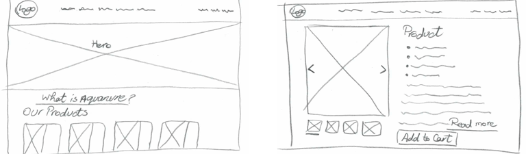
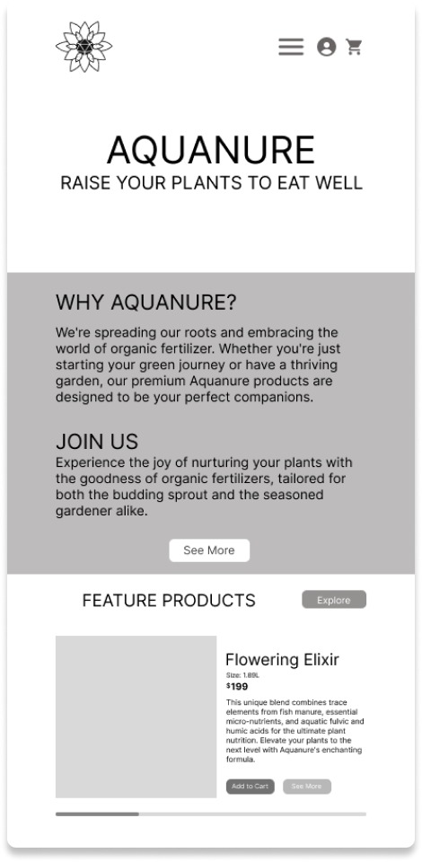
Low Fidelity Wireframes


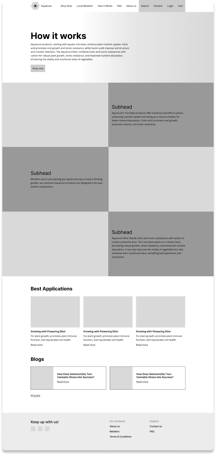
Homepage
Product Page
Education
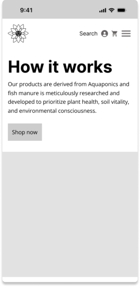
Desktop
Mobile


The designs were iterated and the lo-fi and mid-fi wireframes were tested which resulted in some changes:
Iterations & User Testing
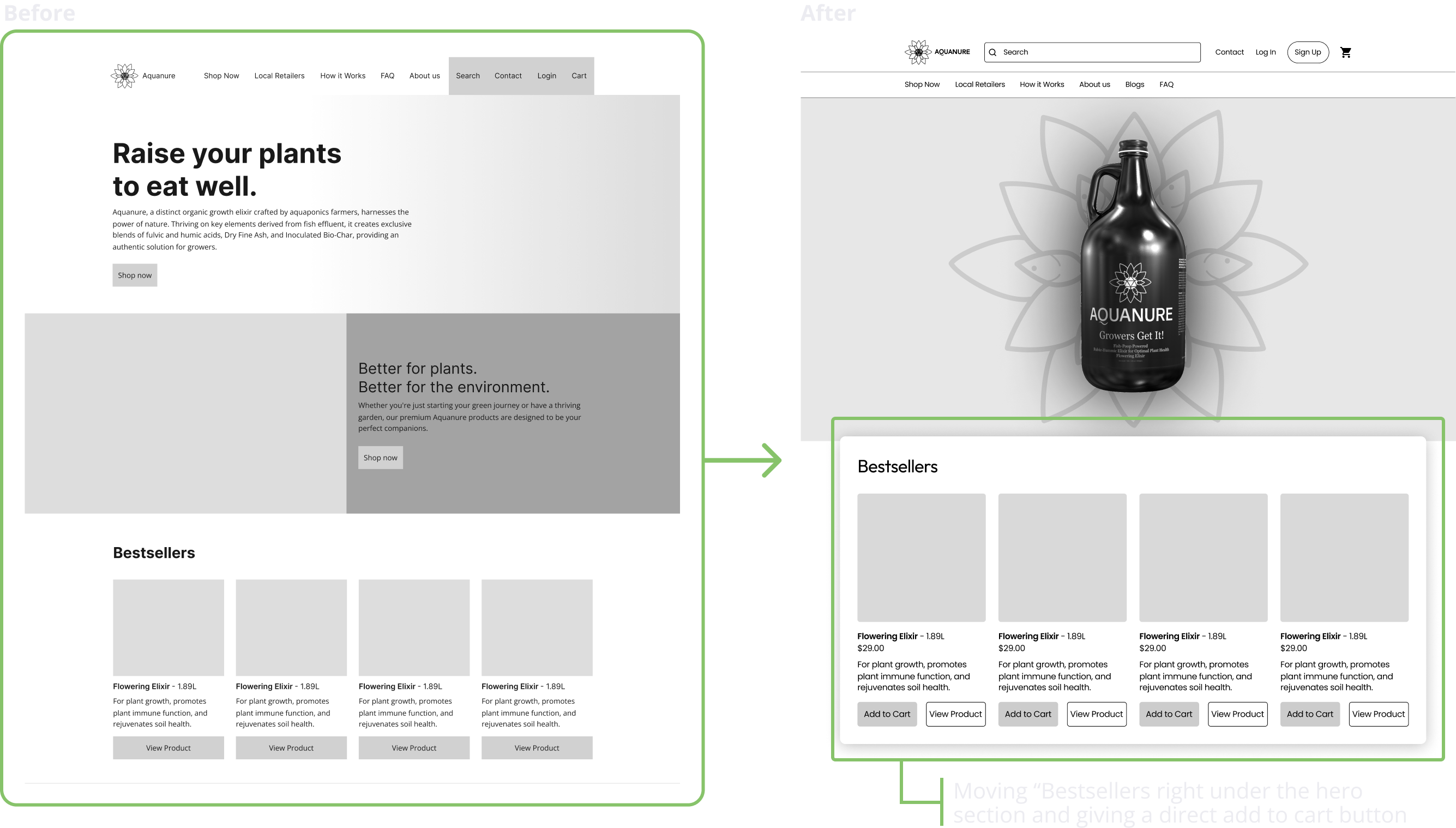
a. Add in visually pleasing product imagery
b. Clearer Copy:
More concise verbiage
Highlight fish manure ingredient
c. A more efficient way to find information about how to use the product and mixing the ingredients
d. Giving a faster way to shop for returning customers
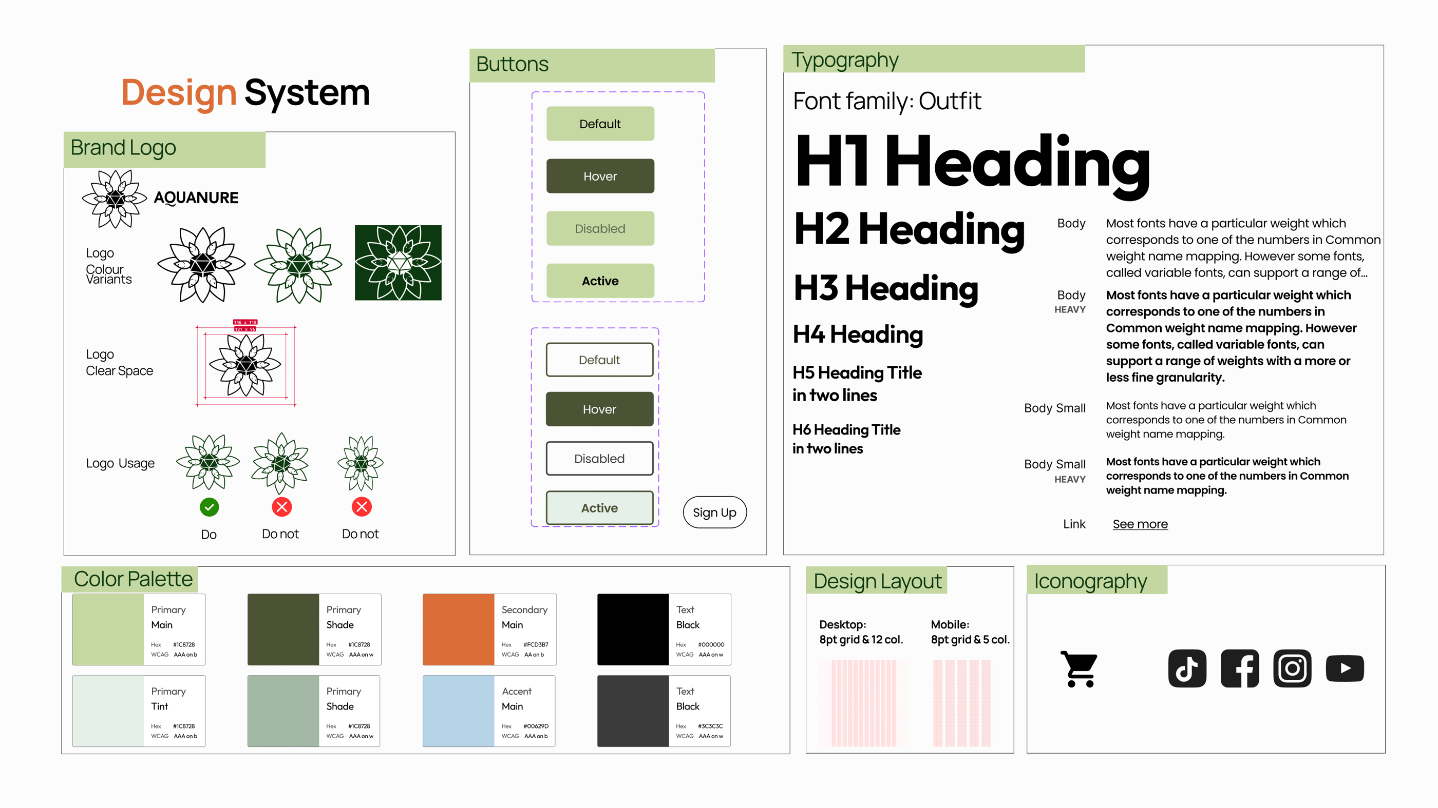
Next, the design system was created.
Design System
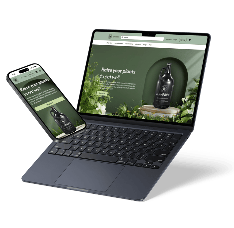
Hi Fidelity Prototype
4. Delivery
Click on each device to see the prototype.
Next Steps
Further Development: Continuing to work with Aquanure to further develop this redesign according to stakeholders directive for relaunch.
Update Features: Working on updating website features and prioritizing user accessibility, such as advanced account settings, and chat bots.
Lessons Learnt
User-Centric Focus: Blending stakeholder goals with user needs. Prioritize a user friendly design that aligns stakeholder objects with a positive customer experience.
Strategic Content Planning is Key: Recognizing the power of strategic content planning in website redesign. By aligning content with both marketing goals and SEO strategies, enhancing visibility, engagement and resonates with the target audience, driving interactions and conversations.
Mobile Optimization Priority: Acknowledging the rise of mobile commerce. Optimize the website for mobile devices, ensuring a responsive design.
Navigation for Seamless User Journeys: Understanding that a well-organized and intuitive navigation system contributes to positive user experience
Credits
Shout out to my teammates Josie, Rebecca, Daniel, and Sunny. Special thanks to Rob Clark, Co-Founder at Aquanure, who kindly provided us with all the necessary information throughout the project.